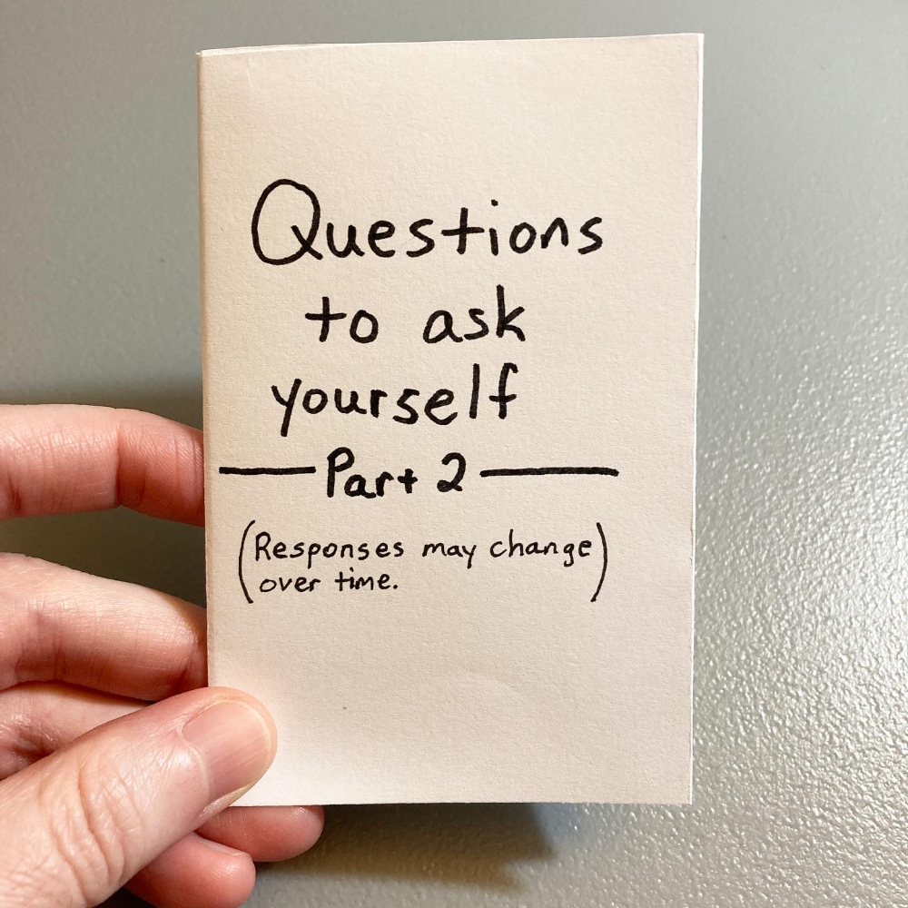
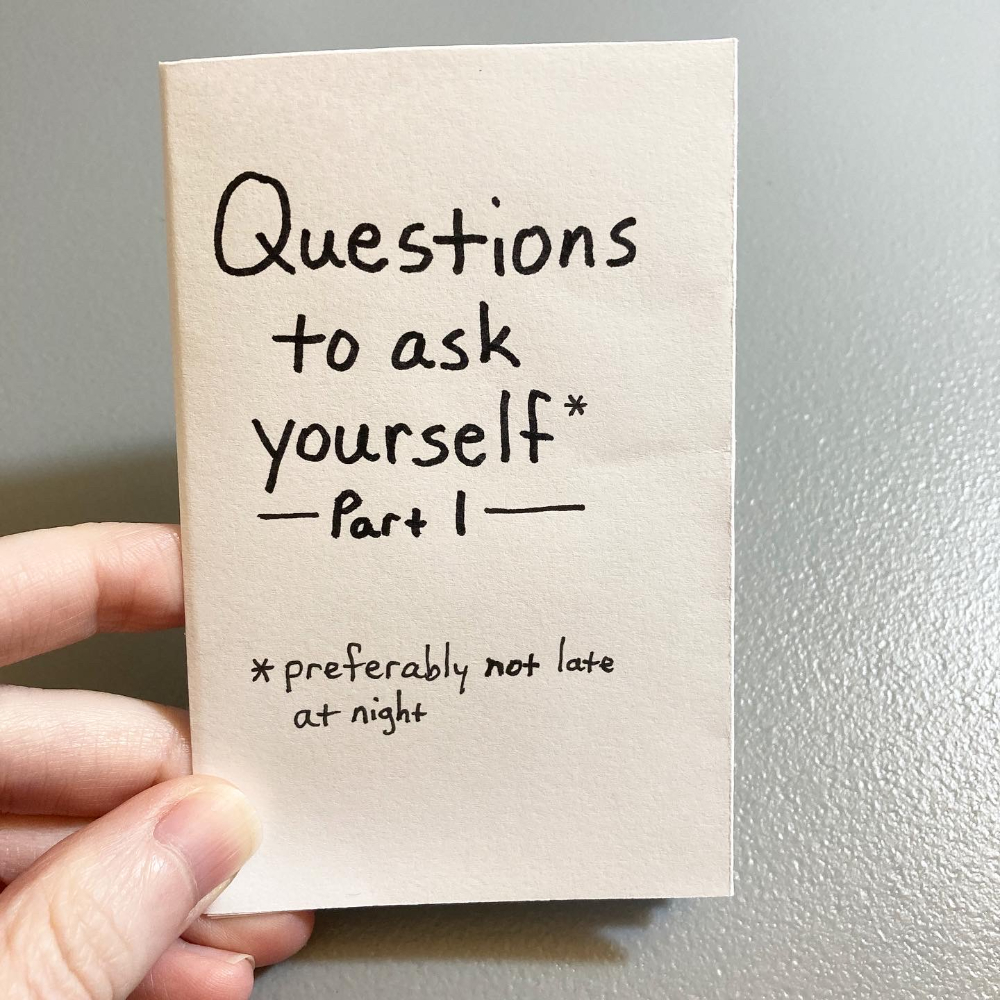
“How to Deal with Small Talk” is a collection of tips for how to handle small talk conversations.
Maybe you’re like me and small talk drags you down. And maybe, like me, you have to put up with it anyway. Hopefully this zine can help.
This zine is printed in full color. I made the background pages using blue, purple, and red inks. Some pages have digital illustrations. All the text is typed.
It might be difficult to tell from the photos, but I tried a new page size for this zine, and I like it! A 12-page zine, printed double-sided on one 8.5x11-inch sheet of paper. The finished zine is about 3.5 inches high x 4 inches wide and bound with staples. And these dreamy cotton candy colors are on every page.
The Philly Zine Fest is accepting submissions for their Anthology zine. I made a collage with a bit of text I’ve been waiting to use somewhere.
The background is photocopied aluminum foil (for real!). I simply cut a piece of aluminum foil and made a copy of it. Then I crinkled the aluminum foil a bit and made another copy. That became the background for this page.
The woman’s face and hands are stock photos taken by Ospan Ali, available on Unsplash. The text is something I wrote a while ago and hadn’t found a place for…until now. 😉
This collage is a very different style for me, and I really like how it came out! The great thing about submitting to zines is that there’s room to experiment. It feels like low stakes, since it’s only one page.
I contributed a page to Webs Across the Campfire, vol. 2, a special Halloween zine from Vlasinda Productions. Copies are available in their shop.
For my page, I wanted to make a collage. I had paper from my ink color experiments to work with. I cut these into shapes for clouds, a moon, and pumpkins.
For the spider webs, I drew on black cardstock with a white gel pen. Then I photocopied the webbing, so I had sections to work with.
Here’s the finished page, with text I printed and glued on, a clip art house I modified, and black cardstock for the hill.
When I worked on my zine, Timers for Travelers, I finished the writing first. I knew I wanted illustrations throughout the zine, some hand-drawn and some digital. I decided to lay out the zine in Canva so that I could combine text, digital elements, and hand-drawn elements.
I’m really happy with how the zine came out, so I want to document my process. This is less a tutorial of Canva and more a walk-through of how I used it to put together my zine.
Canva is a free tool for graphic design. Although there are paid tiers, everything in this post was done with the free version. You can use Canva directly in an internet browser and there are apps you can download, too. If you haven’t used Canva before, you’ll need to create a free account.
Create a new file in Canva
Click on the Create a new design button and then click on Custom size. Enter the dimensions for your zine pages. For example, a quarter page zine would be 4.25 inches wide x 5.5 inches high. This file becomes your working file.
Make your zine
Make the pages of your zine with whatever method works for you. You can write text directly in Canva. I find it easier to do all my writing first in a word processor (I use Google Docs) and then copy and paste text into Canva.
Canva has a lot of graphic elements and images you can use for free. All the photos available in Canva are stock images from Pexels and Pixabay, and they are royalty-free.
Since you can upload images into Canva, you can draw on paper and scan pages. Then upload your drawings into Canva, and add them to your working file.
Note: Add page numbers last! If you’re making pages and don’t know what order they’re going to be in yet, don’t number pages. Instead, add page numbers after you have pages arranged in the order you want for the finished zine.
Print your zine
I like leaving my working file as is, like a draft. So when it’s time to print my zine, I make a copy of the working file (File » Make a copy). This becomes the print file.
Since the pages will be printed on 8.5 x 11-inch paper, cut, folded, and stapled, they need to be arranged in the correct order for printing.
To figure out the print order of the pages, I make a mock-up version of the zine with scrap paper. There are lots of ways to do this. Here’s how I figure out page order.
Go to the print file in Canva and rearrange the pages for printing. You can drag and drop pages or use the up and down arrows above each page to change where they are.
When I’m moving a lot of pages around, I like working in grid view. Click on the button in the bottom right of the screen that looks like a stack of papers with a number on it.
When you’re done arranging pages, download the print file as a PDF. Click on the Share button (top-right). Then click on Download. For “file type,” choose “PDF Print.”
Open the PDF file on your computer. Go to print settings. Find the option for pages per sheet, and change this to 4. This will print 4 of your zine pages on one 8.5 x 11 piece of paper. Make sure two-sided printing is selected.
Print your zine. Cut the pages in half horizontally and then fold them. If you ordered the pages correctly in Canva, then the pages should be in the correct order when you assemble them as a booklet.
How do you arrange zine pages so they print in the correct order? There are lots of ways to do this, depending on the size of your zine and the number of pages. Here’s one method for quarter-page zines.
Shout-out to Ryan at Pocket Thoughts. His method for printing quarter-page zines is the first one I learned. What I have below is similar to the way he does it.
Here’s how I determine page order for printing zines.
This example is with a quarter-page zine where the cover is blue cardstock and the interior pages are standard white copy paper.
Printing a quarter-page zine on 8.5 x 11-inch paper means that you have 4 zine pages on the front of the sheet of paper and 4 zine pages on the reverse side of the sheet. So that you don’t have (unintentional) blank pages, your total number of zine pages should be a multiple of 4.
I make a paper dummy (aka mock-up) to figure out the page order. The process might be difficult to follow in writing, so I made a video explaining my method. The rest of this post is the method written out.
To make the mock-up, I use scrap paper that’s the same size as what the actual zine will be printed on (8.5 x 11 sheets of paper). If you’re going to have a different paper for the cover, you can use a different color of scrap paper or just mark the paper somehow so you know that’s the cover.
Cut the 8.5 x 11-inch pages in half horizontally.
Then fold the half-sheets vertically and put them together as a booklet. You should have the same number of pages as what you want your finished zine to be. Zines with 16 pages are common, so that would be the covers plus 12 interior pages.
Don’t staple the pages since you’ll be taking them apart anyway.
Label the front cover, back cover, and interior pages.
Take the pages apart, unfold them, and lay them out as if they were 8.5 x 11-inch sheets of paper. You’ll have groupings with 2 half-sheets. Then you can see how the zine pages should be ordered for printing. Flip the half-sheets over to see which zine pages would be on the reverse side of the page. This will show you how to arrange zine pages for double-sided printing.
Depending on the number of pages in your zine or if you want to use a different type of paper for the cover, you may end up with a half-sheet on its own. In this case, for the print layout you can copy and paste the top half of the sheet to the bottom half. So on the 8.5 x 11-inch sheet of paper, the top half would be the same zine pages as the bottom half.
Take notes so you remember the page order. These can be rough since they’re just for reference when you’re arranging pages in layout.
I use “1A” and “1B” to indicate that’s one sheet of paper, front side (1A) and back side (1B). Then “2A” is the front of the second sheet of paper and “2B” is the back of the second sheet of paper.
As long as you figured out the sequence correctly, you’ll be able to print and assemble your zines in the correct page order.
“Timers for travelers” is a 20-page zine about time travel. It includes:
Why timers are important to time travelers
Tips and warnings for traveling through time
Time travel methods
Pages were made with a combination of hand-drawn illustrations, digital elements, and typed text.
The zine measures 5.5 inches high x 4.25 inches wide (quarter-page zine). The cover is blue cardstock. Interior pages are printed in black and white on 24lb white paper. The zine is hand-folded and bound with staples.
“Everyday Time Travel” is about ordinary moments that feel like time moves differently than normal.
Out of the zines I’ve made so far, this one probably came together the fastest, from the initial idea to the finished zine.
I made the backgrounds with scrapbook paper, and I added some details with fineliner pens. Then I wrote the text on white paper, tore out pieces, and glued them over the scrapbook paper. I like how all the colors and patterns came together.
“Vignettes From Camelot” includes glimpses into the lives of Arthurian characters: Merlin, Morgana, Arthur, and an unnamed messenger.
The zine is 16 pages long with 4 original stories and hand-drawn illustrations inspired by nature and magic. It’s printed in black and white. I couldn’t decide on a blue or white cover, and neither could my Instagram poll. 😂 So I made both versions.
The stories in this zine started as a series of tweets I wrote a few years ago. My original idea was to write 10 tweets in a thread and have that be one story about people in Camelot. I never finished that, but I took the ideas I had for Merlin, Arthur, Morgana, and a messenger and fleshed them out into these vignettes.
I drew the illustrations by hand using black and gray markers and pens. I wasn’t sure which illustrations would go with which stories, so I drew each page individually. Here are a few of the original illustrations.
When I finished all the illustrations, I scanned them so that I could do the layout digitally.
I used Canva to lay out the text and illustrations. I made many of the illustrations semi-transparent so that the text over them was readable. In some cases, I put white boxes behind the text, so that the words stood out without adjusting transparency on the illustration. Here are two of the pages in Canva.
After I laid out all the pages, I did a few test prints to see how everything looked on paper. I made a some adjustments, and then printed several copies for my Etsy shop.
“Photographic Memories” is a collection of illustrations, writing, and memories related to photography.
It’s a quarter-page zine and 20 pages, which makes this the largest and longest zine I’ve made to date! The zine is printed in black and white and mostly hand-made with some digital elements.
It took me a while to make this zine. I knew I wanted to focus on photography, but beyond that, I didn’t know what to include. I knew I didn’t want it to be a how-to guide or lessons on photography. You can google all that and nothing I make would be as extensive or informative.
Instead, I thought about things that stuck with me—concepts and memories—and that’s what I made pages about. Here are some previews:
I made each page individually and then laid out pages by hand. The original pages look like this:
I used sticky notes to label each page, so I wouldn’t lose track of what goes where. I scanned pages, added some white space as buffer, and then printed copies.
I learned a lot by making this zine in a larger and longer format than I’ve done before. I already have plans for my next zine. It probably won’t be as long but it’ll be the same page size.
About a year ago, I stated making zines. It was something fun to share with friends, but then the pandemic hit, and we all stayed home. I couldn’t share my zines in person, so I started posting them to Instagram. I had no expectations for how people would respond. People seemed to like them, so every time I made a new zine, I posted it.
I attended a couple online workshops and (virtually) met people who make zines. That created a small community for me, which has been great during a year of limited social interaction.
I post my zines on Instagram and my blog, so anyone can read them digitally. But if anyone wanted a physical copy, there wasn’t an easy way to get one. Last August, I started an Etsy shop. Again, I had no expectations.
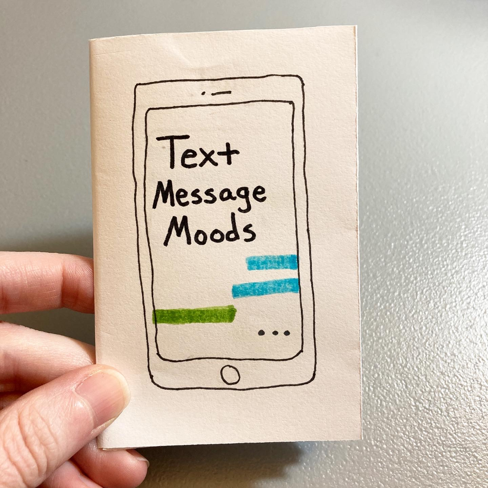
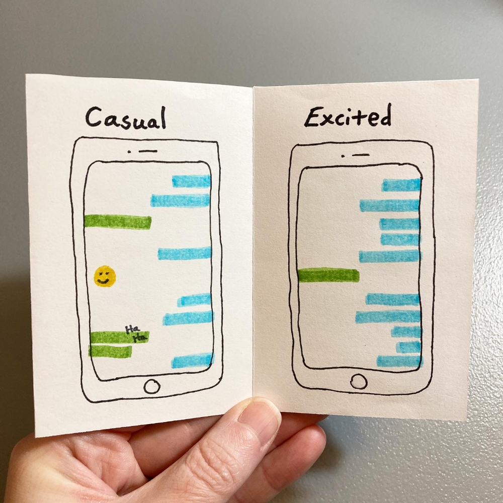
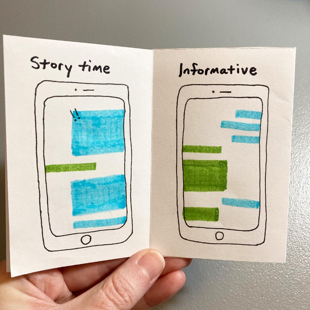
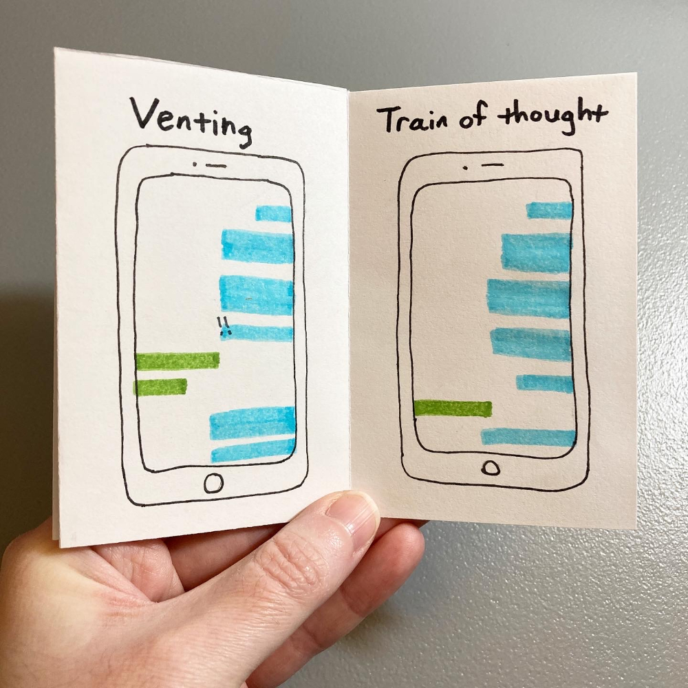
This week, I got a message about this zine:
A librarian who purchased Text Message Moods asked if she can use it as an example in a student workshop. I said yes because 1) it’s an opportunity to support education and 2) that’s super cool! A year ago, I would have never thought something I made would be in a workshop for students across the country.
It started with me making zines for friends.
Then I posted zines to Instagram.
Then I found more people who make zines.
And then someone who saw my zines reached out to me.
All of this to say—If you’re working on something (writing, art, poetry, film) and you aren’t sure how it’s going to go…share it anyway. You don’t know if people will like it until they see it. You can’t guess what connections you’ll make through your work.
Put your creative work out there, and see where it goes. It might lead you somewhere surprisingly good.
I contributed a page to Pocket Thoughts Annual #3, a collaborative zine that features 25+ zinesters from around the world. Each contributor was welcome to do whatever they wanted with their page. I made this astronaut illustration:
I wanted to go for a collage look, but still where I made each part of it. This is what the elements looked like, before I put the page together:
I started with black cardstock and a white gel pen for the stars in the background. If you’ve seen my space-themed illustrations, you know I love drawing stars on black paper. 🙂
I drew the astronaut on white cardstock and the…cloud thing on black cardstock with a black fineliner and white gel pen. Then I cut those out.
The white strips on the left of the page are pieces of white cardstock.
II printed the text using my Phomemo printer. It’s so handy for little things like this!
And then I glued everything into place. To send it in for the zine, I scanned it, so I could send a jpg.
Making this page took a while since I created each element separately, but I’m really happy with how it came out.
I have some sample fountain pen inks from The Goulet Pen Company that are colors I would not write with, but they are definitely colors I would draw with. A bright yellow ink reminds me of caution tape, so I created this zine of everyday dangers, with the danger highlighted in yellow on each page.
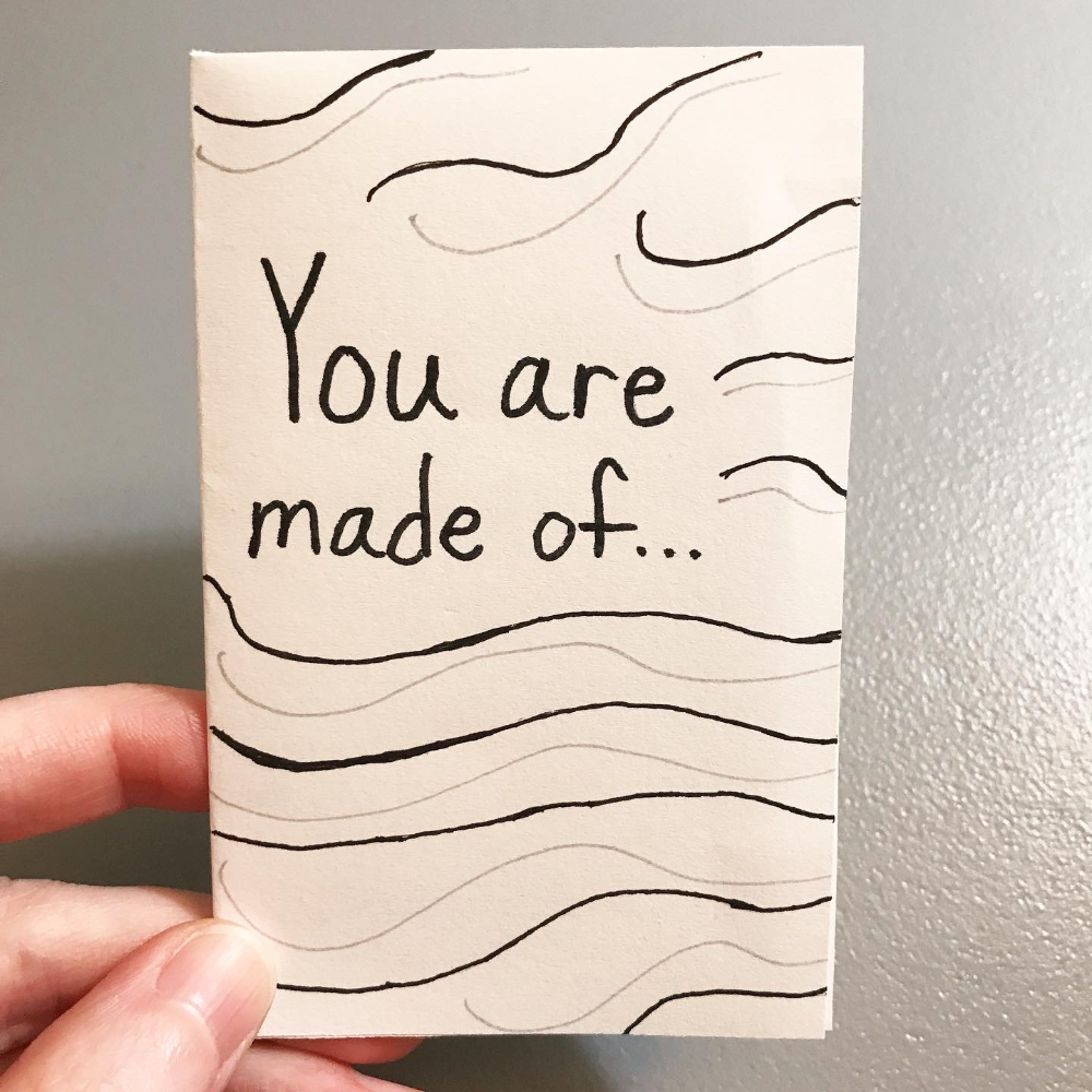
I wanted to do a space and sea theme for a while, but I was stuck on the words. And then NASA found water on the moon.
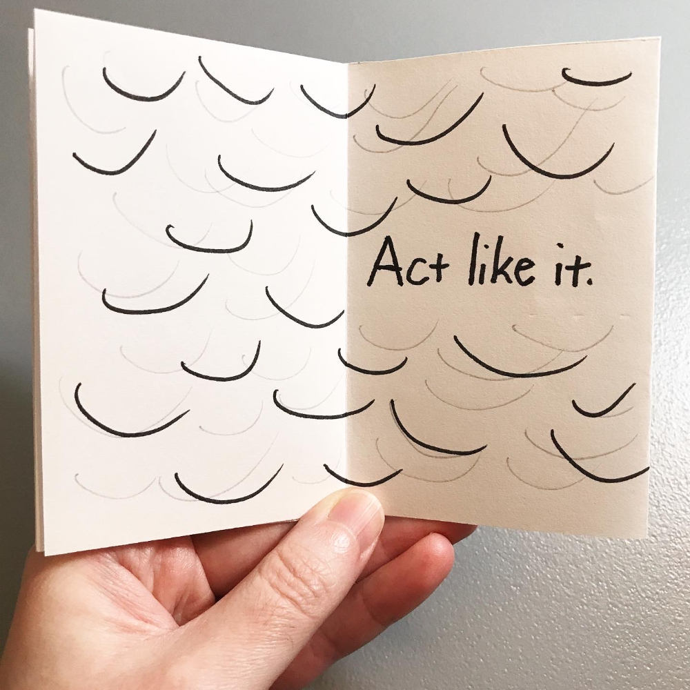
I love how the colors, text, and illustrations came together. If you want to read about my process for this zine, keep scrolling after the images. 🙂
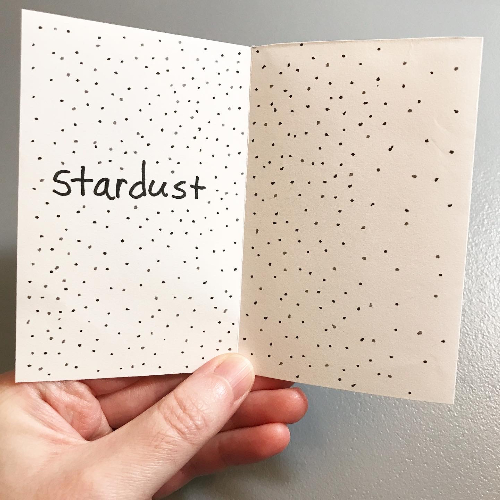
I started with a white sheet of cardstock and used blue and black stamping inks to build the background colors.
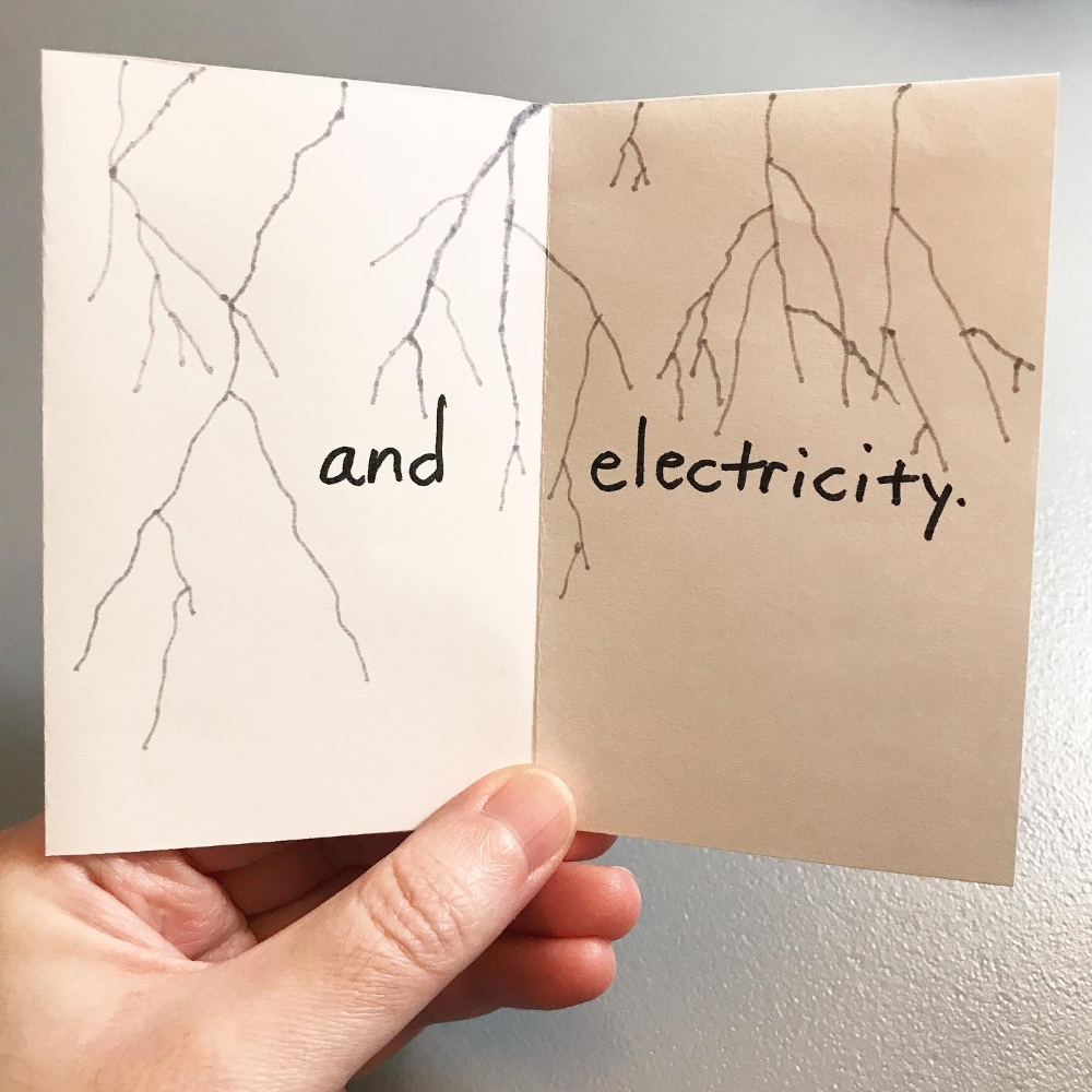
The blue ink is distress oxide ink, so it reacts with water. After the blue and black inks dried on the page, I sprayed the blue area with water and used a clean brush to move the water around and add some texture. Then I let it dry completely. I drew the seaweed and everything else in the blue area with Tombow dual brush pens.
I drew the stars and moon in the black area with a white gel pen.
Full disclosure: I wanted to draw little Daleks and built the rest of this zine around them.
Bonus material
Planning
If I don't quite know what I want to write or draw, I plan out the zine on one page, like so:
This acts as a rough draft of my zine, so I can sort out what I want on each page.
Guiding
I like to work on zines with the page unfolded, so I use small sticky notes to label each page, like this:
This lets me work on pages in whatever order I want, without losing track of the order in the folded zine. And, having the page unfolded means I don't have to worry about ink bleeding through to another page.