“What’s a zine?” is an 8-page mini zine that you can download and print on your own. It includes a brief introduction to zines: what zines are, some historical highlights, and common formats.
The zine is available on Ko-fi for free (or pay what you want).
The PDF is sized to print on one sheet of 8.5 x 11-inch paper (standard U.S. letter size).
This zine is licensed under Creative Commons (CC BY-NC-SA 4.0), which means you’re welcome to distribute and share copies for non-commercial use.
If you don’t know how to fold this kind of zine, search for “how to fold an 8-page zine” on YouTube to find tutorials.
I’m working on a new zine, and I want to share some process pics with you. 🙂 I’m making pages with black and white illustrations and then using washi tape to make collage elements.
Here’s how I’m doing it.
Draw the picture in black ink.
Lay a piece of tracing paper over the drawing. With a pencil, outline the area where washi tape will go. For this page, I wanted a curved shape around the planet.
Use washi tape to cover the area outlined in pencil. I kept even lines of tape but you could overlap pieces or rip the tape into smaller pieces.
Flip the tracing paper over. Use scissors to cut along the pencil line.
“So You Met Your Past Self” includes tips for what to do when you meet a past version of yourself. This fictional zine is a handy guide for the time traveler in your life (even when that’s you).
I made the background for this zine by hand. I diluted blue fountain pen ink in water. Then I painted the ink on to watercolor paper.
After the paper dried, I drew an abstract design with a dark blue marker and white gel pen.
This kind of line drawing is a technique I learned from Katie Gebely.
First you draw dots on the page, at random. Then you connect the dots with straight lines. That’s what I did with the dark blue marker. Then I added shorter lines in white gel pen.
I wrote an essay for The Wrench Dispatch: The Movie Issue about visuals in Barbie and Pleasantville. The zine came out in January 2024 and collected essays about recent movies.
The essay is about 900 words, so I’m going old school and putting it under a Read More. So retro.
Five ways the Barbie movie uses visuals to share information about the world
The Barbie movie starts with a reference to the monolith in 2001: A Space Odyssey, and that’s how I knew that visuals would be important in this movie.
Barbie isn’t the first movie to share so much information about the world through visuals, but it’s the first one I’ve seen in a while to do it so well. Pleasantville (1998, directed by Gary Ross and starring Tobey Maguire and Reese Witherspoon) uses color and 1950s sitcom tropes to share information about the world.
Let’s take a look at how these movies use visuals.
1. Saturated colors are positive
In Barbie Land, colors are saturated and bright. The color palette leans heavily on pinks (so many shades of pink!). The sky is a perfect shade of blue, and the grass is a perfect shade of green. Nothing is out of place.
When Barbie and Ken go to the real world, colors are not as saturated. They feel more grounded. The outfits that Barbie and Ken wear while rollerblading have neon colors and busy patterns. They stick out immediately in the real world, even though the outfits would have been normal in Barbie Land.
In Pleasantville, David and Jennifer are transported to Pleastantville, a black and white 1950s-style sitcom. When everything is normal in Pleasantville, objects and people are in black and white. As Jennifer starts influencing the town, objects take on saturated colors, starting with a red rose. Characters appear in color after they express themselves or reach their potential.
Barbie uses colors to differentiate between Barbie Land (vibrant colors) and the real world (grounded colors). Pleastantville uses the transition from black and white to color to show changes in the sitcom world and characters.
2. No liquids in Barbie Land
There aren't any liquids in Barbie Land to fit the concept that there aren’t any liquids in Barbie playsets. Barbie takes a shower, but no water comes out of the shower head. She gets a carton of milk from the fridge, but the carton is empty. Barbie can walk across the pool because the surface is a sheet of blue plastic. And even the beach doesn’t have water, which is why Ken bounces off a rigid wave when he tries running into the ocean.
Pleasantville does have liquids. There's maple syrup at the breakfast table, and characters drink soda at the diner. But one thing Pleasantville is missing is toilets. In one scene, Jennifer goes into the bathroom at the diner and pushes a stall door open. It’s an empty space. This is a reference to TV standards in real life. In the 1950s and 1960s, American TV shows did not show toilets. It was considered bad taste.
3. Vehicles are props
Barbie knows how to drive but her car seems to go on its own. In one scene, she waves to other Barbies and even takes both hands off the wheel. The car continues on a perfect path on the road. Also, the car’s rear-view mirror is a sticker, playing into the idea that it’s there for show instead of function. The car is a toy and Barbie doesn’t actually need to look in the rear-view mirror while she drives.
In Pleasantville, the firefighters drive the firetruck, and they know how to use the ladders to rescue cats. But they don’t know what the hoses are for, since there weren’t fires in Pleasantville before. The firemen are surprised that the hoses work, because they never needed to use them before.
4. No one uses the stairs
All the dream houses in Barbie Land have stairs, but no one uses them. Barbies appear on one floor and then a different floor, much like how a child would move a doll from one floor to another in a dollhouse.
A similar thing happens in the sitcom world in Pleasantville. Scenes take place upstairs or downstairs, but we do not follow characters up or down the stairs. This adds to the construct of sets for TV sitcoms.
5. Physical appearance isn’t natural
Barbies in Barbie Land move in realistic ways, but details remind us that Barbies are dolls. When Barbie steps out of her slippers, her feet stay on tip-toes, as if she’s wearing heels. When Barbie walks, sometimes she poses her hands with straightened fingers (much like a Barbie doll's hands), instead of relaxed hands. There are moments when Barbie sits up or stands where her upper body moves as one, reflecting how Barbie dolls bend at the waist but otherwise have limited upper body movement.
After Barbie has thoughts about death, she loses some of her doll-like features. On the beach, she notices her feet are now flat. When she’s talking to Weird Barbie, Barbie notices she has cellulite on her thighs. These two examples show Barbie connecting with the real world.
In Pleasantville, there aren’t body changes, but there is a notable shift in how people look and carry themselves. Early in the movie, characters conform to each other. The women are in cardigans and poodle skirts with perfect makeup and hair. The men are all clean cut in tidy clothes. Everyone has good posture.
As the movie progresses and colors seep in, we see variations in their outfits and more relaxed body language.
Barbie and Pleasantville use visuals to tell the audience about the world. Both movies deliver visual information through colors, deviations from objects in the real world (liquids, vehicles, and staircases), and physical appearance. All these visual details enrich the characters and stories in Barbie and Pleasantville.
“How to make a mini zine” is an 8-page mini zine that you can download and print on your own. It includes a brief introduction to zines and instructions for how to fold an 8-page mini zine from a single sheet of paper.
The PDF is sized to print on one sheet of 8.5 x 11-inch paper (standard U.S. letter size). No access to a color printer? No problem — the zine looks great in black and white, too.
To fold the zine, you can follow the instructions directly on the PDF. Or if you prefer video instructions, search for “how to fold an 8-page zine” on YouTube.
This zine is licensed under Creative Commons (CC BY-NC-SA 4.0), which means you’re welcome to distribute and share copies for non-commercial use.
“The antidote to social media” is a mini zine that looks at how negative things are outweighing positives on social media. But social media platforms are still a good way to find people to connect with. The zine suggests ways to work around the negative aspects of social media.
“Children of Immigrants” is a half-page zine that collects art and writing about immigrant experiences. Thirteen people contributed stories, poetry, photography, illustrations, and collages.
The finished zine is 8.5" x 5.5", 28 pages (including covers), and printed in full color.
Everyone who contributed to the zine received a complimentary copy. The rest of the copies sold out, mostly at Lancaster Zine Fest. 😃 So, no more physical copies but you can download a digital version from Ko-fi for free or pay what you want.
Note: The digital version is a PDF meant to be read on a screen. The PDF is not formatted for printing and folding a paper copy.
“Shoveling sand” is a 20-page zine that collects my favorite writing advice from several writers. I grouped quotes by themes including “keep a notebook,” “don’t worry about being popular,” and “get the first draft down.”
This zine measures 5.25 inches high x 4 inches wide. The cover is printed in full color on white cardstock. The interior pages are printed in black and white on 24 lb. white paper. Designed and laid out in Canva.
“Cat’s Cradle” is a tiny story about mimicking someone. It’s not quite sci-fi, but it feels like it…maybe because it was inspired by a scene near the end of Annihilation. (I won’t spoil the movie and neither does the zine.)
Here’s the full text of the story:
It’s like playing cat’s cradle,
but we aren’t using string.
I do one thing.
She does something else that feels like…
an extension. A continuation.
And then we swap.
She does one thing—
says a phrase, draws some lines, moves her arm
just so.
I extend—
a line of poetry, a floral doodle, a yoga pose.
And then we swap.
The training protocol doesn’t specify how to teach.
Just that I’m supposed to.
Doctor Who celebrates its 60th anniversary next month. I collected some quotes from the Doctor in a zine…with random hipster photos. 🤭 Saturated colors, vintage objects, and a soft tone—this style of photo was all over the internet in the late 2000s and early 2010s.
“Modern-day Sisyphus” is a mini zine about 21st century tasks that never go away.
The zine is inspired by Sisyphus, a figure from Greek mythology who is tasked with rolling a boulder up a mountain, only for the boulder to roll back down every time he reached near the top.
Page 2 lists chores that are repetitive: washing dishes, doing laundry, dusting, and vacuuming. At the bottom of page 2, there’s an illustration of a man rolling a boulder up a hill.
Pages 3 and 4 list tasks that are repetitive: making the bed, replying to emails, mowing the lawn, taking out trash, and paying bills. At the bottom of the pages, there’s an illustration of a man rolling a boulder up a hill.
Pages 5 and 6 list positive things that are repetitive: listening to favorite songs, making a cup of coffee, saying good night to loved ones, cooking favorite meals, celebrating holidays, and spending time on hobbies. At the bottom of the pages, there’s an illustration of a man rolling a boulder up a hill.
“Song lyrics I mishear” is a mini zine that lists lyrics where I hear the wrong words. Each page is about one song and includes the actual lyrics along with what I hear instead.
I wanted the interior pages to be a mix of typed text (the actual song lyrics) and handwritten notes (the words I hear). This way, the pages look like they’re annotated.
I made tutorials that show how to set up a design file in Canva to make an 8-page mini zine. The tutorials go over how to set up guides and what the page order will be. Everything in the tutorials is done with the free version of Canva.
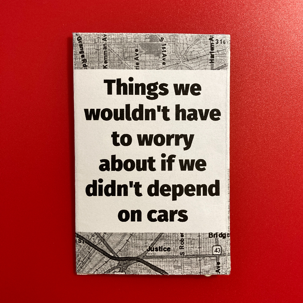
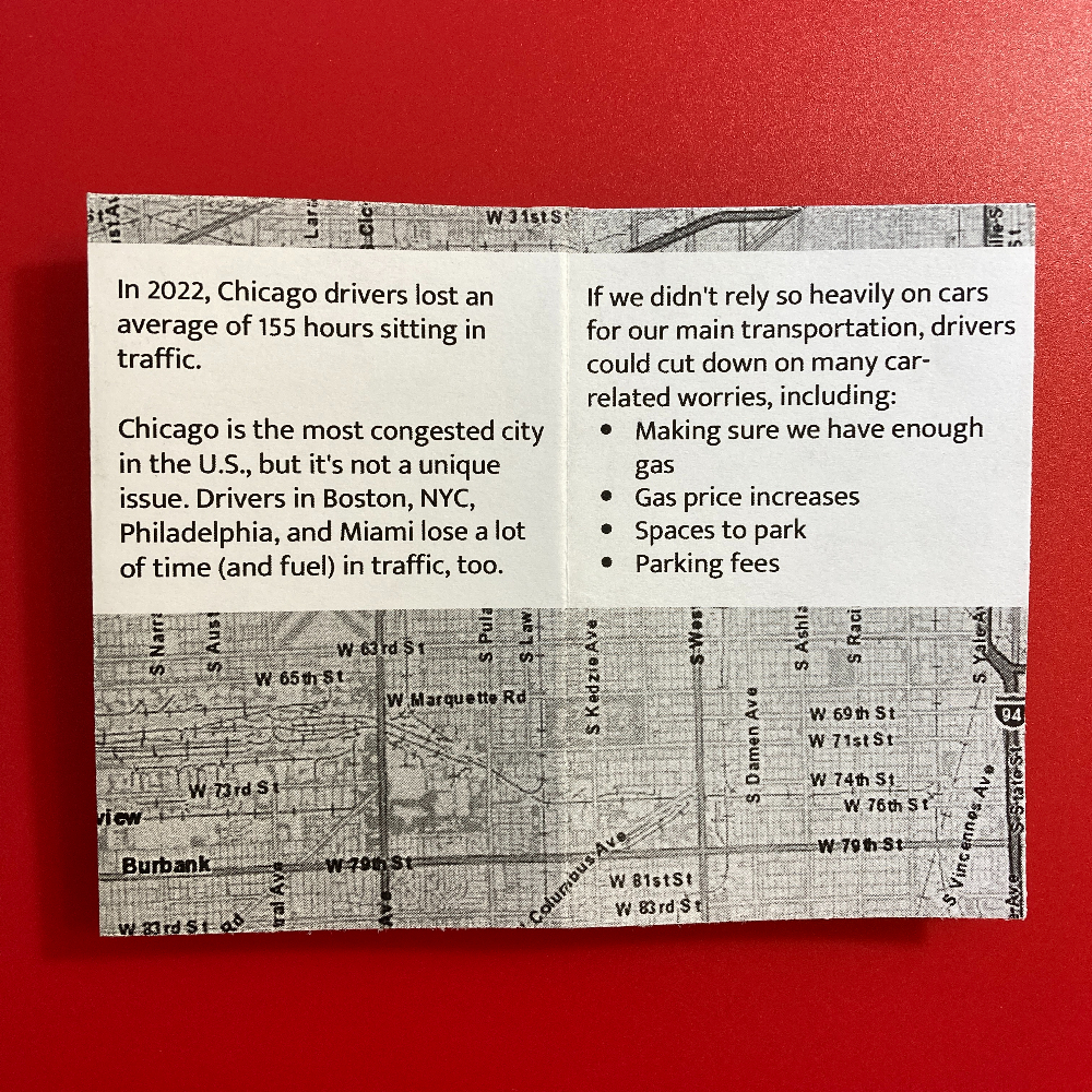
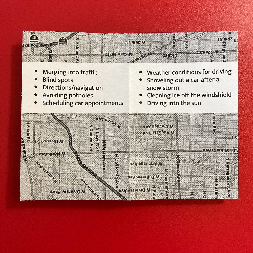
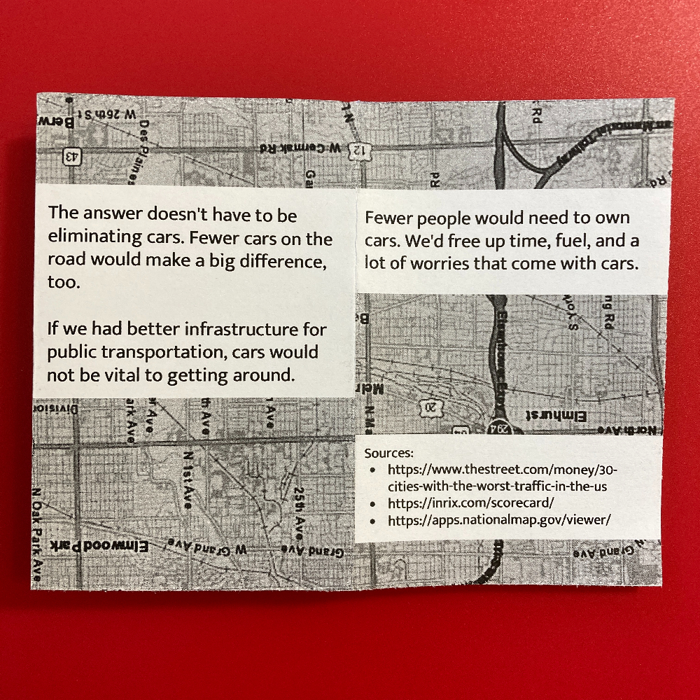
I’ve been particularly annoyed lately about how much we depend on cars, so I made a little zine about it. I’m not saying we should eliminate cars completely. I want better public transportation so everyone has more and better options for getting around.
“An Incomplete History of Zany Brainy” is a 20-page zine about a U.S. retail chain from the 1990s. These stores focused on affordable, educational toys for children.
The zine includes background on Zany Brainy, my favorite toys from the store, and what happened to Zany Brainy after the company declared bankruptcy in 2001.
I also made a digital version that is available on Ko-fi (free or pay what you want). You can download the zine as a PDF to read on your favorite screen. Note: This is not formatted for printing and folding a paper copy.
I had a lot of fun collecting info and reminiscing about Zany Brainy while I made this zine. I hope you enjoy reading it!
“Playground games in the 1990s” is a pros and cons list of recess activities that were popular in elementary school. (At least in central Pennsylvania, in the 1990s.)
Each page includes small illustrations relating to playground activities. I drew on Whitelines paper so I could draw with a regular pen and then photograph the paper to use the drawings digitally.
“Movies I never want to see again” is about movies I watched one time and do not want to watch again. This doesn’t mean they’re bad movies! But something about them makes me feel like once is enough.
“My 20-minute rule for movies” is about how I don’t feel guilty when I stop a movie I don’t enjoy. I give any movie a fair chance, but I’m okay turning it off if it’s not for me.
I made this zine in Canva. It’s 12 pages, printed in black and gray scale on orange paper.