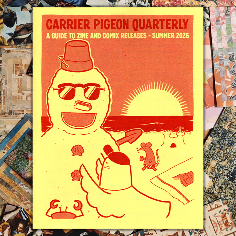
Zine fest is about a month away, so I’ve gotta start folding. 😅
I used photo collections in Micro.blog to create a page with my featured zines. Then after the photos, I added links to each zine.
I made a quick page about zine trades. I think so far when people have asked me to trade, it’s been on Instagram. But now I have info in the Fediverse, too. 🙂
Here’s what I do for test printing zines, which is the stage in my zine-making process between text and images are done and everything looks good to go.
Step 1
I realize I’m done with writing and visuals. I do a little happy dance (in my head) because the hard part is over.
Test prints are tedious. Folding zines can be tedious. But I don’t consider that hard work. The hard work is going from a blank page to a page that’s covered in Stuff, in the ways you wanted to cover the page with Stuff.
Step 2
I print one copy of the zine on standard copy paper. Plain white, 20lb paper. Nothing fancy. I don’t adjust any settings.
I fold the zine and look at each page. In this step, I’m looking at spacing. Is anything cut off? Anything that needs to be moved a bit? If I have something centered, does it actually look centered on the folded zine?
Next I’ll read through the zine once, front to back. I read out loud so I can hear if a sentence sounds awkward or too long.
I look for spelling and punctuation mistakes.
I mark up edits with a pen, so I know what to adjust when I’m back on my computer.
I should note an important thing: I try not to make edits on paper and on the computer at the same time. I make edits on paper first. Then I go to my computer and make edits to the file.
Step 3
I make edits on the computer, following the notes I marked on paper.
I print another test copy and fold the zine.
This time I’m looking for anything at all that needs to be tweaked. Wording, spacing, alignment.
I read the zine in reverse, back to front, bottom of each page to the top. It’s a tip I picked up in college to help catch mistakes – read your work sentence by sentence, but in reverse. From the end to the beginning.
I mark up changes in pen.
I repeat step 3 as many times as I need to, until I’m happy with everything in the zine.
Step 3.5 (optional)
Sometimes I decide to rewrite at least half the text at this point. The outcome is better writing, a better zine. But ugh, rewrites can feel tedious. Maybe I have to re-do spacing or re-think images I’m using.
I keep telling myself, this will result in a better zine.
Go back to step 3.
Step 4
I print one copy of the zine on the paper I want to use for all the copies. For mini zines, that’s usually 24lb paper. Just a little thicker than standard copy paper, so it feels nicer. Sometimes I bump up to 32lb paper. That feels like a special occasion.
I fold the zine and do a final check that everything looks good.
Then I print copies. I usually make 10-15 copies. I give away some copies to friends. I end up trading a few copies. And I put 5 copies in my Etsy shop.
And then I’m done.
Pretty straightforward process, as long as I don’t get caught in too many rewrites.
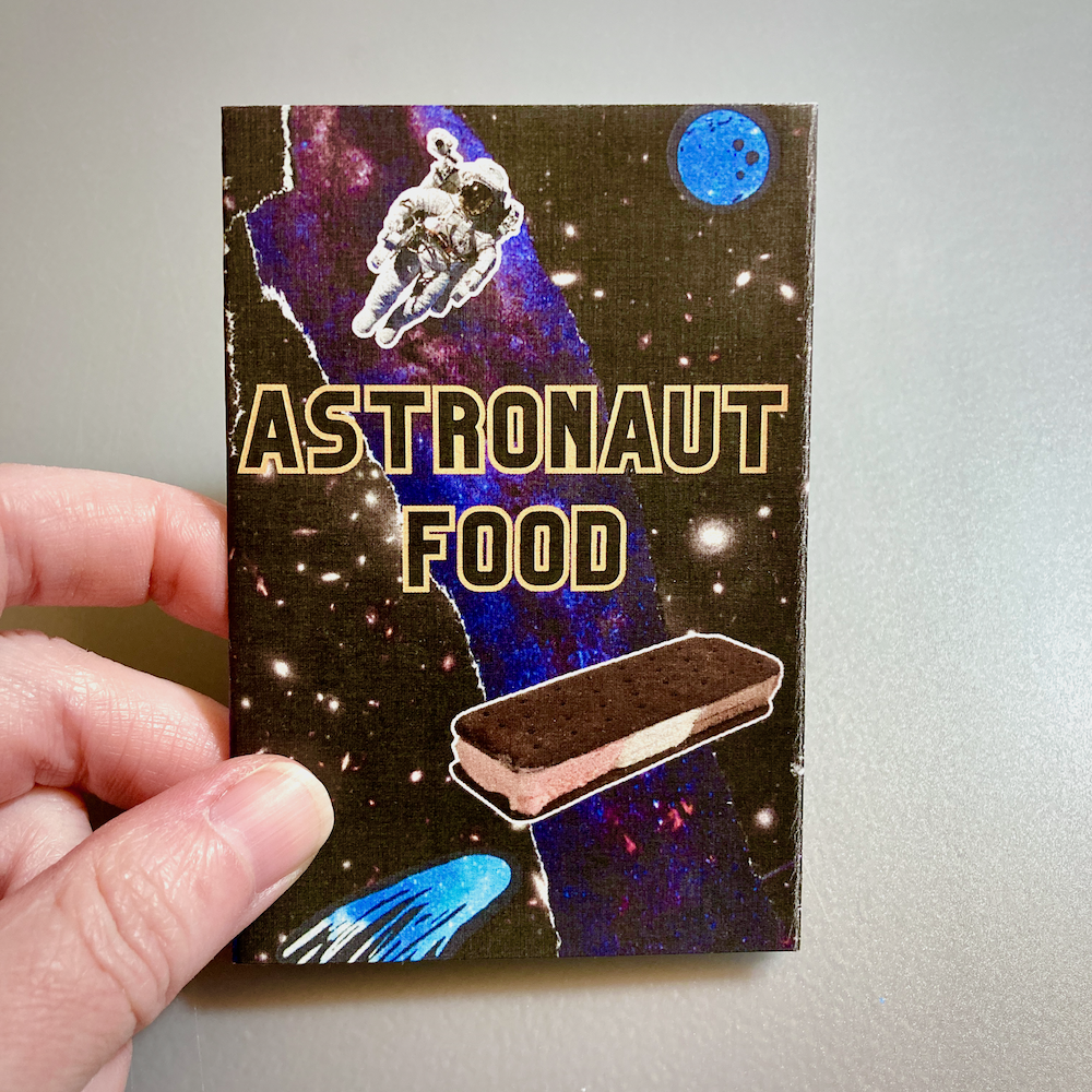
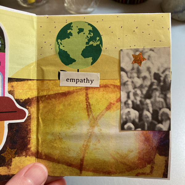
New zine! “Astronaut Food” is a mini zine about freeze-dried food that astronauts eat in outer space.
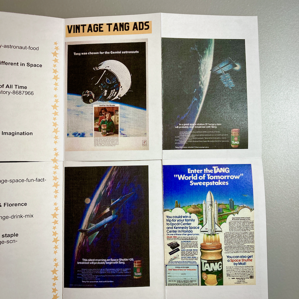
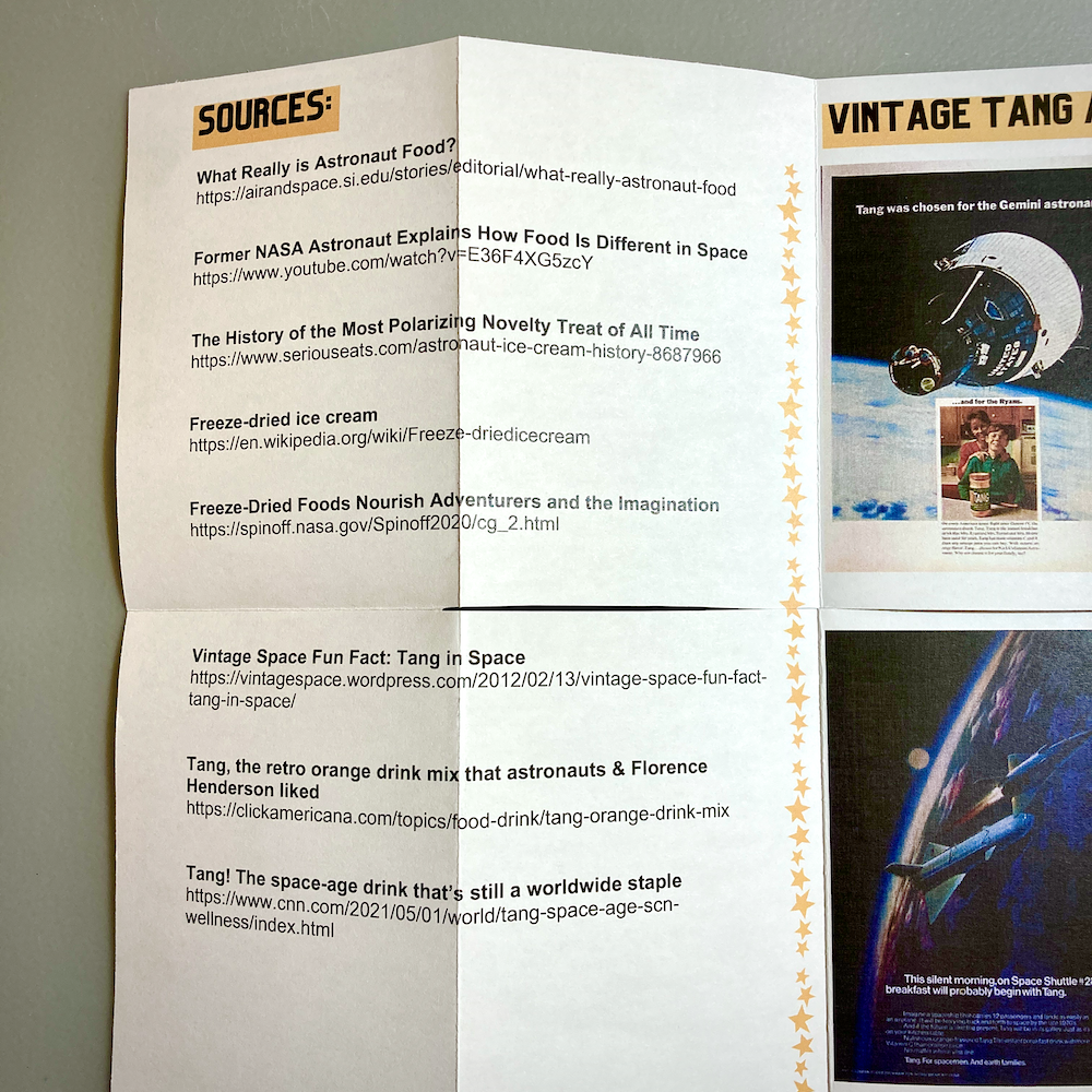
The zine includes history about developing food for NASA missions. The back side of the zine (when unfolded) shows vintage Tang ads and a list of sources.
If it’s giving Bill Nye episode, that’s my intent. 😉
I made a collage using space imagery for the background of the zine. All text is typed.
Copies are available in my Etsy shop (U.S. only), and I’m also open to trades.
See below for photos and full text of the zine.
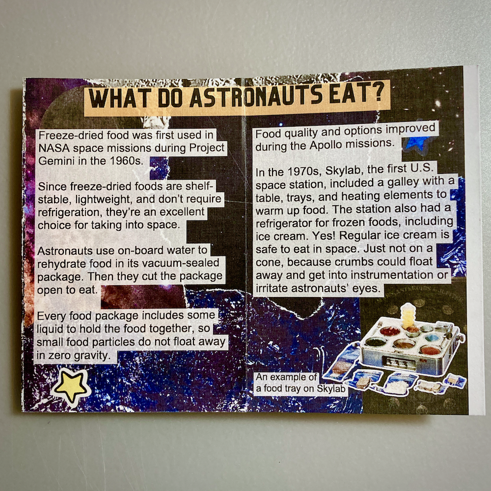
What do astronauts eat?
Freeze-dried food was first used in NASA space missions during Project Gemini in the 1960s.
Since freeze-dried foods are shelf- stable, lightweight, and don’t require refrigeration, they’re an excellent choice for taking into space.
Astronauts use on-board water to rehydrate food in its vacuum-sealed package. Then they cut the package open to eat.
Every food package includes some liquid to hold the food together, so small food particles do not float away in zero gravity.
Food quality and options improved during the Apollo missions.
In the 1970s, Skylab, the first U.S. space station, included a galley with a table, trays, and heating elements to warm up food. The station also had a refrigerator for frozen foods, including ice cream. Yes! Regular ice cream is safe to eat in space. Just not on a cone, because crumbs could float away and get into instrumentation or irritate astronauts’ eyes.
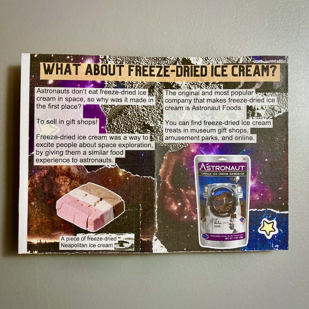
What about freeze-dried ice cream?
Astronauts don’t eat freeze-dried ice cream in space, so why was it made in the first place?
To sell in gift shops!
Freeze-dried ice cream was a way to excite people about space exploration, by giving them a similar food experience to astronauts.
The original and most popular company that makes freeze-dried ice cream is Astronaut Foods.
You can find freeze-dried ice cream treats in museum gift shops, amusement parks, and online.
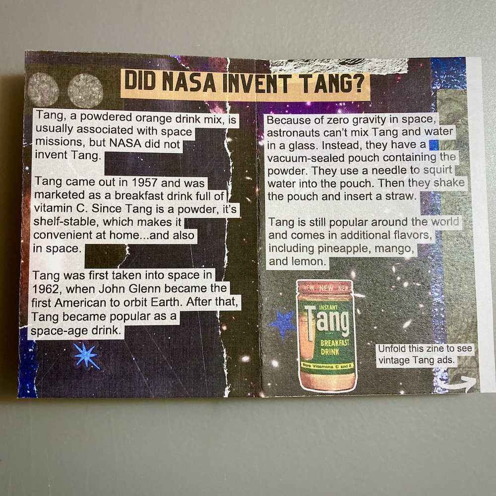
Did NASA invent Tang?
Tang, a powdered orange drink mix, is usually associated with space missions, but NASA did not invent Tang.
Tang came out in 1957 and was marketed as a breakfast drink full of vitamin C. Since Tang is a powder, it’s shelf-stable, which makes it convenient at home…and also in space.
Tang was first taken into space in 1962, when John Glenn became the first American to orbit Earth. After that, Tang became popular as a space-age drink.
Because of zero gravity in space, astronauts can’t mix Tang and water in a glass. Instead, they have a vacuum-sealed pouch containing the powder. They use a needle to squirt water into the pouch. Then they shake the pouch and insert a straw.
Tang is still popular around the world and comes in additional flavors, including pineapple, mango, and lemon.
I make zines for fun, and I want zines to be primarily for fun, so I don’t set specific goals each year. Even so, I’m really happy with what I accomplished in the past year!
Here’s a rundown of zine-related things I did in 2024.
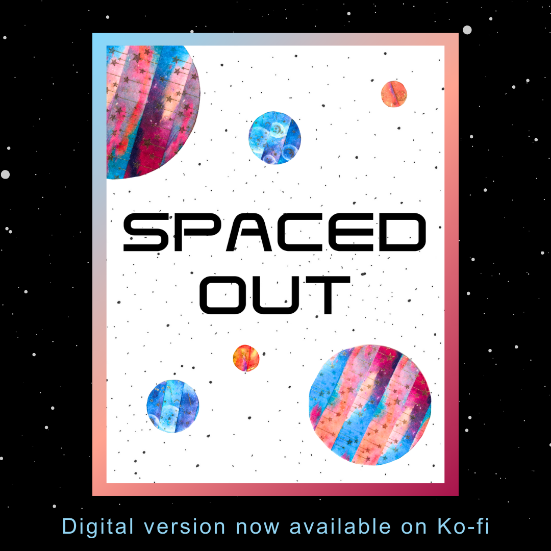
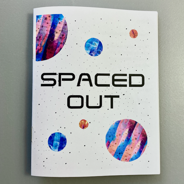
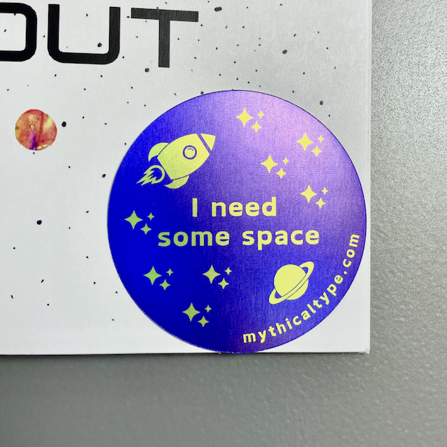
I made holographic stickers to go with this zine! This is an updated design of my “I need some space” stickers. Every physical copy of “Spaced Out” comes with a sticker.
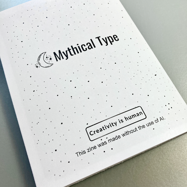
I added a note to the back of my zine about not using AI.
I’ve been seeing some artists clarify that they don’t use AI in their work, and I think it’s an important distinction to make. I already have a webpage about why I don’t use AI. Now I have a note in print, too.
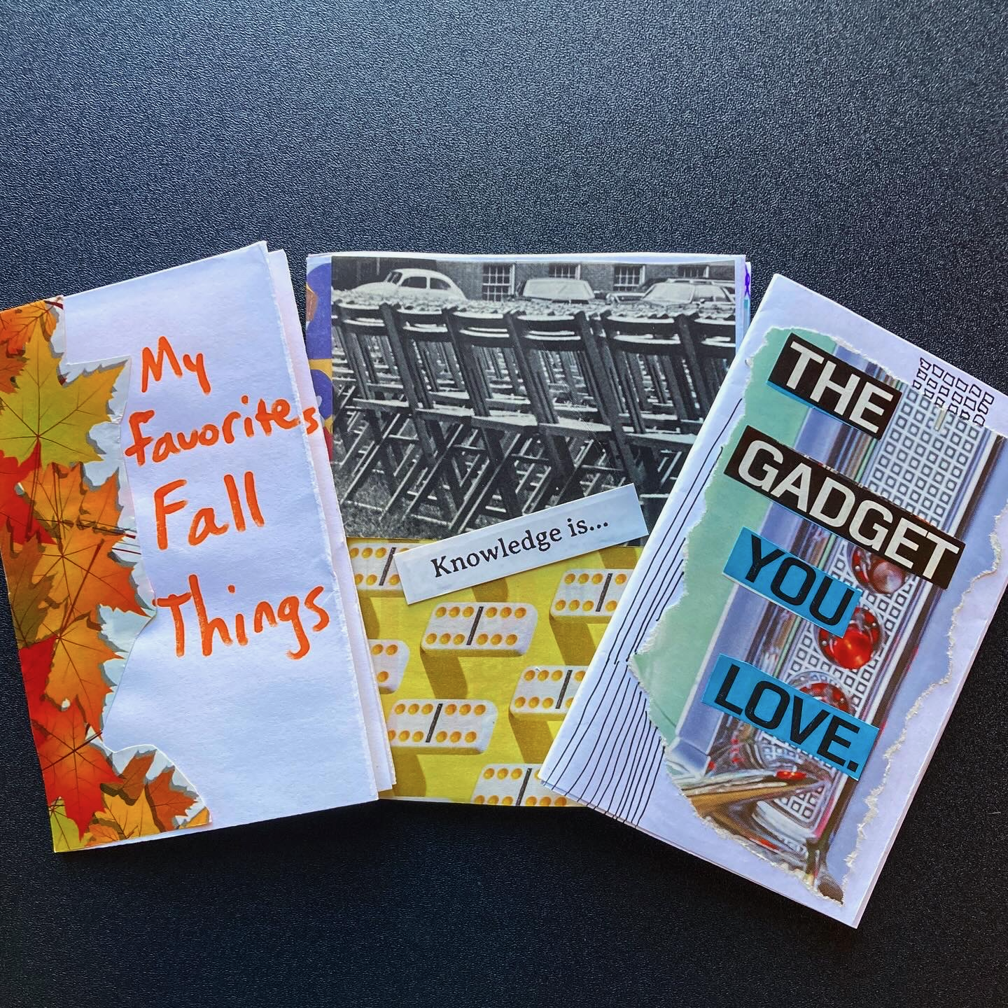
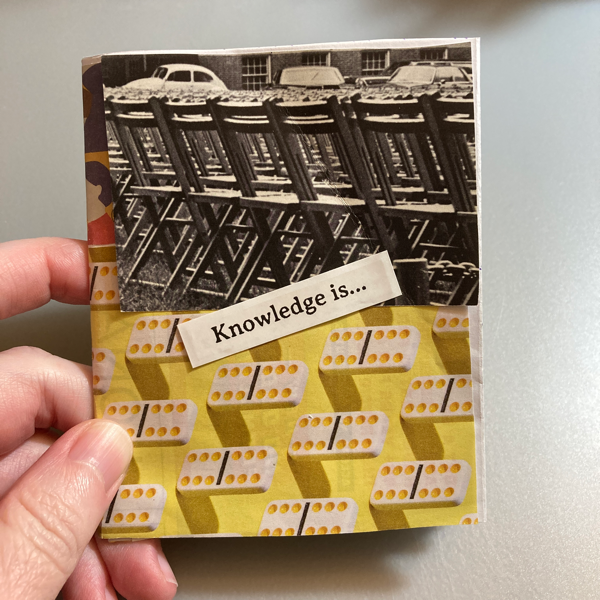
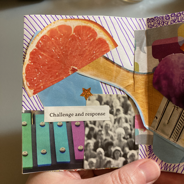
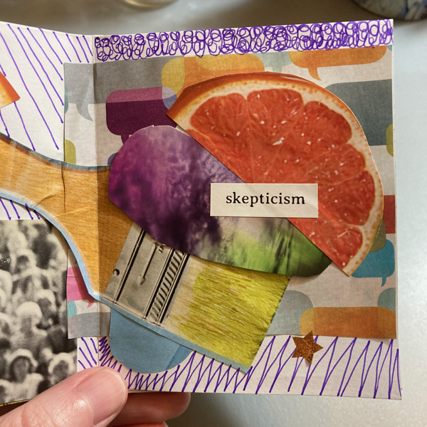
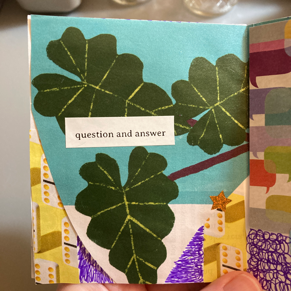
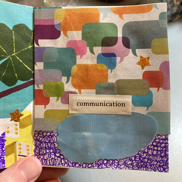
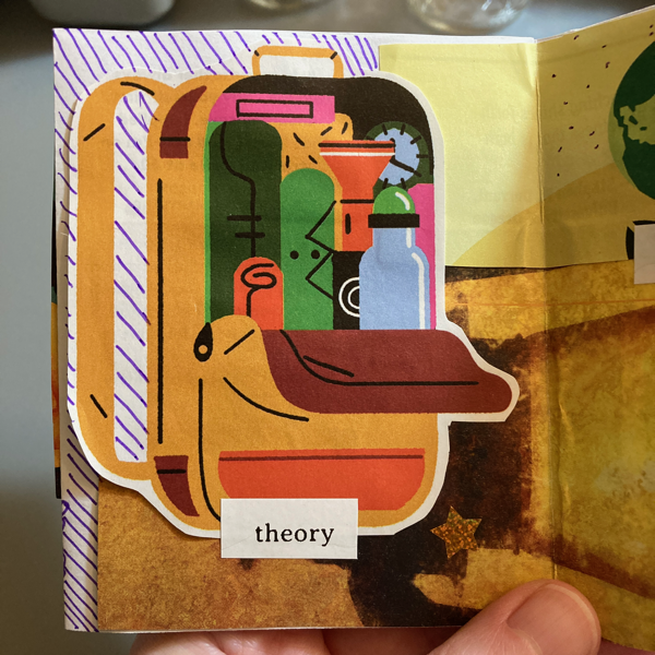
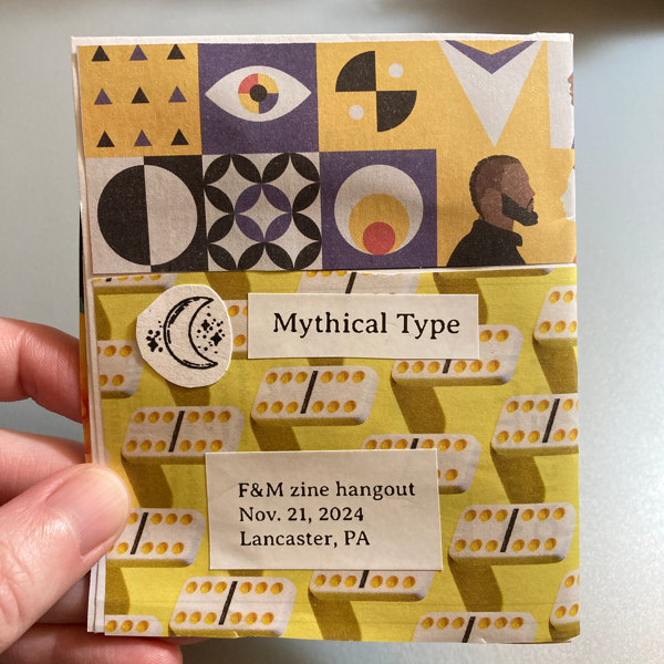
Here’s a collage zine I started at a local zine hangout on Thursday and finished tonight.
I like experimenting during zine-making events, so this style is very different from the zines I usually make.
The images are pretty random. 😂 I was looking more at colors and patterns, with less regard for items in each image. Text is inspired by old card catalog entries (cards were on the tables, among archival materials available to use).
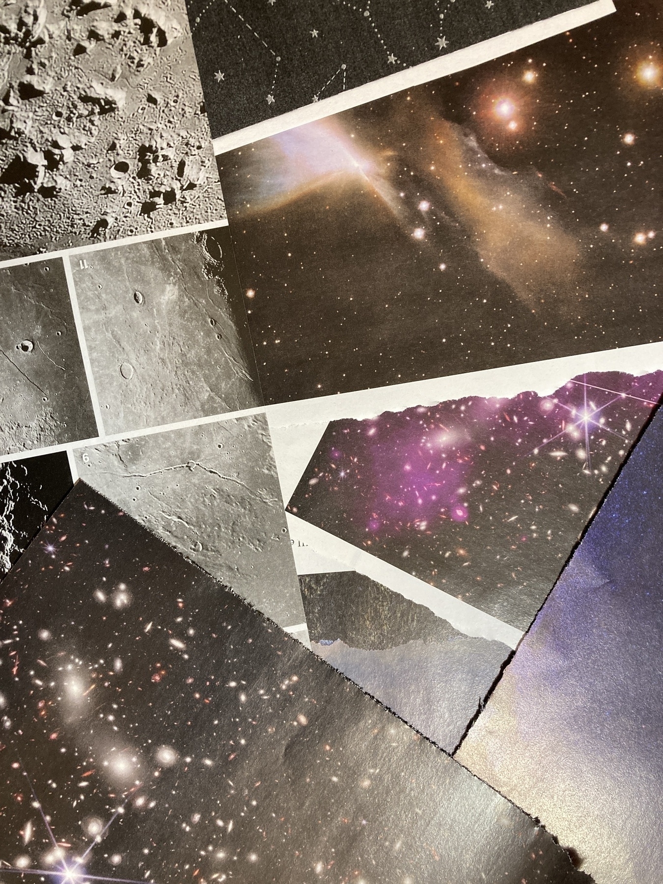
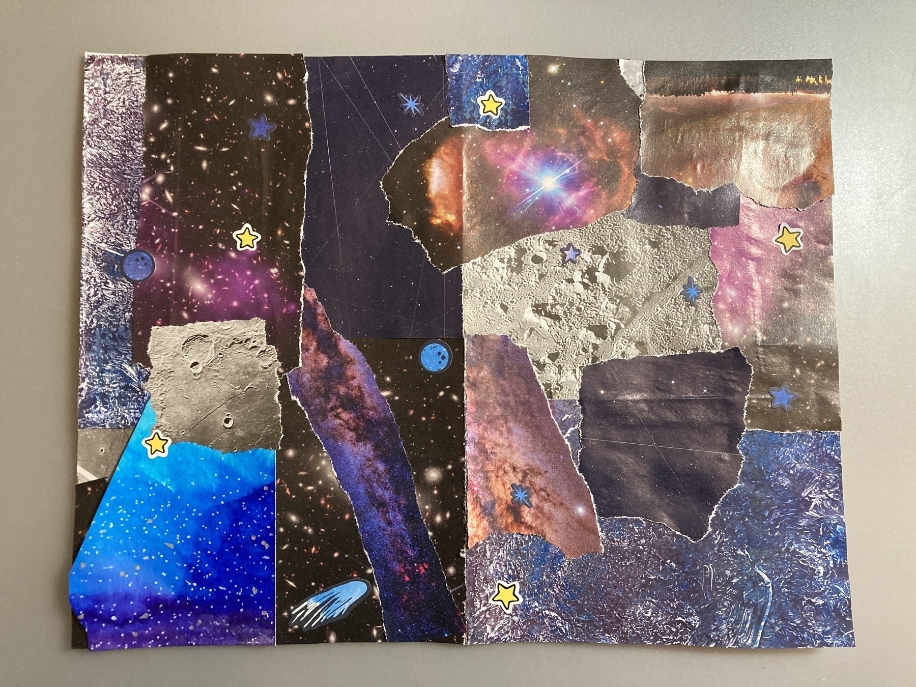
I’m working on a new mini zine about astronaut food. For the background, I wanted to collage a bunch of images of stars, the night sky, and related textures.
I collected images out of an issue of Astronomy magazine, and I gathered some illustrations and scrapbook paper I had.
Here’s a photo of some of the images.
Here’s a photo of what the collage looks like.
Next I’ll scan this into my computer, add more images digitally, and then add text (…which I still have to write).
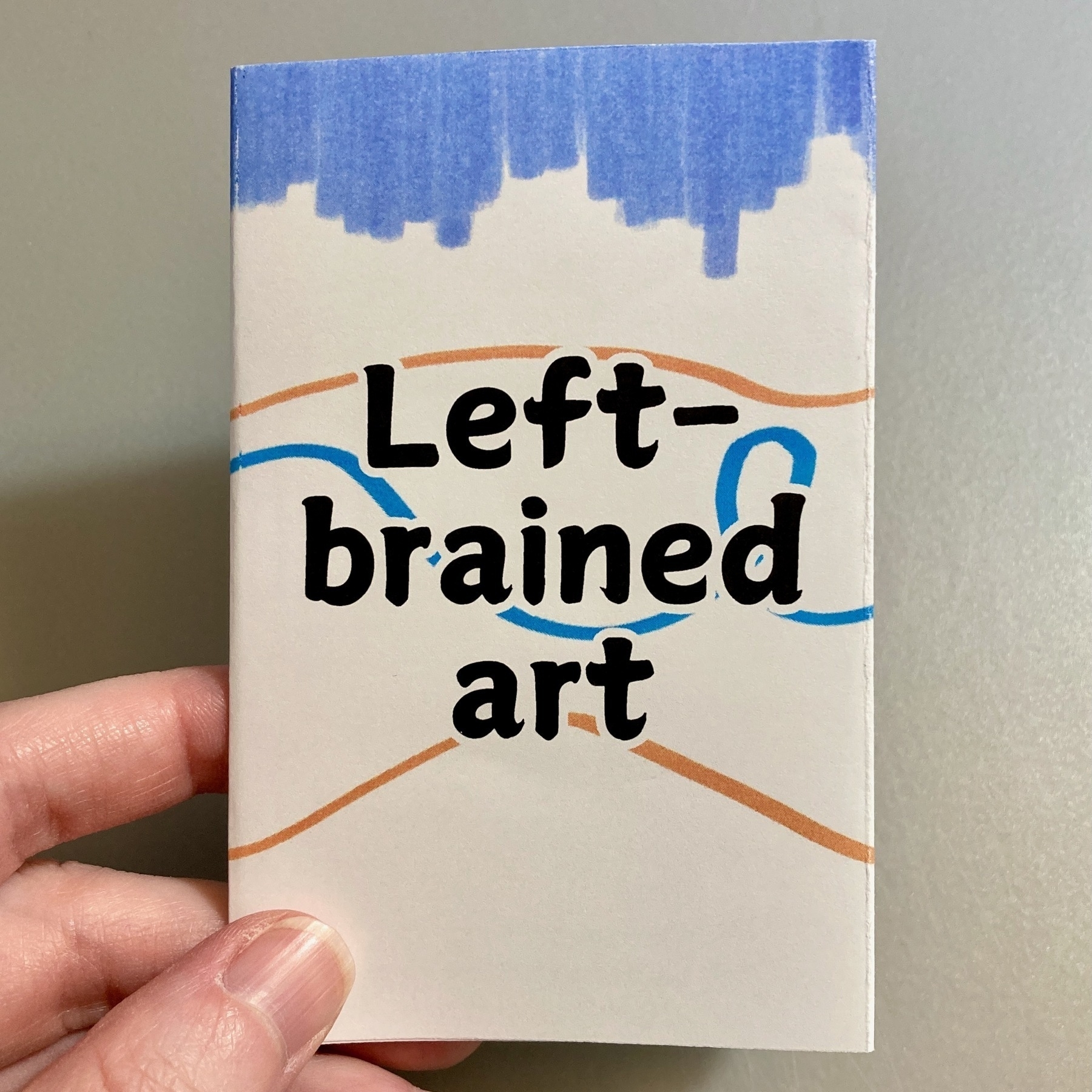
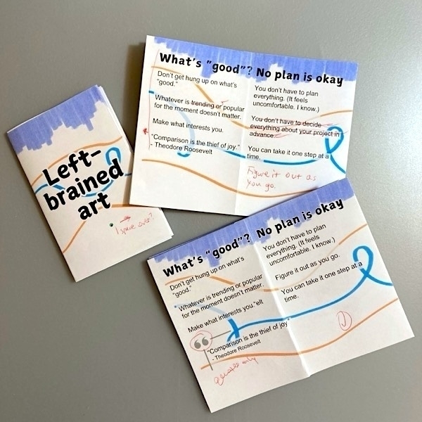
“Left-brained art” is a mini zine that includes tips for how to make art without having to plan all the details up front. Each page includes a tip and brief explanation.
This zine encourages you to work with the materials you already have and not worry about what people will think of the finished work.
I drew the background by hand with markers. Layout and text in Canva.
Copies are available in my Etsy shop (U.S. only). I’m also open to trading! (Message me.)
Full text in the zine:
Front cover
Left-brained art
Page 1
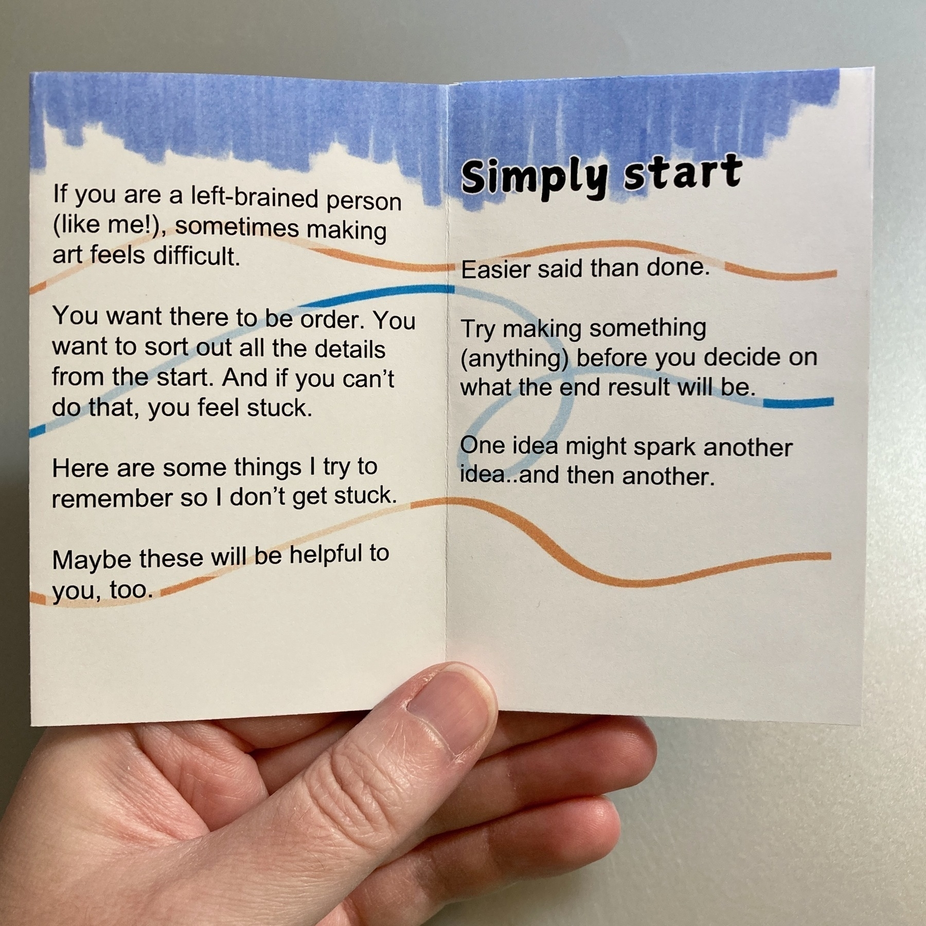
If you are a left-brained person (like me!), sometimes making art feels difficult.
You want there to be order. You want to sort out all the details from the start. And if you can’t do that, you feel stuck.
Here are some things I try to remember so I don’t get stuck.
Maybe these will be helpful to you, too.
Page 2
Simply start
Easier said than done.
Try making something (anything) before you decide on what the end result will be.
One idea might spark another idea..and then another.
Page 3
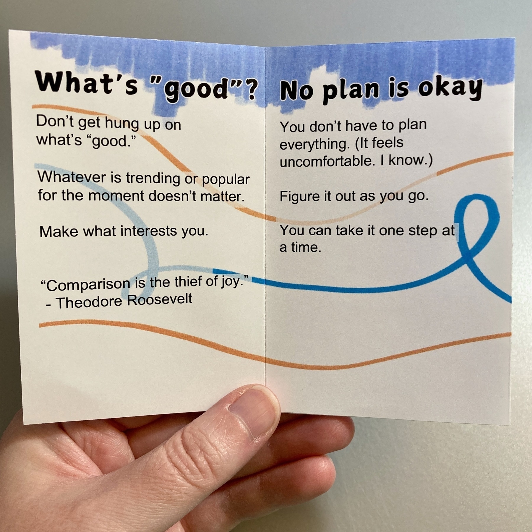
What’s “good”?
Don’t get hung up on what’s “good.”
Whatever is trending or popular for the moment doesn’t matter.
Make what interests you.
“Comparison is the thief of joy.”
– Theodore Roosevelt
Page 4
No plan is okay
You don’t have to plan everything. (It feels uncomfortable. I know.)
Figure it out as you go.
You can take it one step at a time.
Page 5
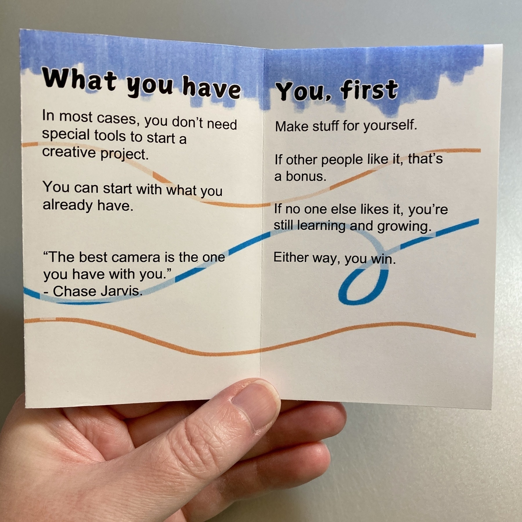
What you have
In most cases, you don’t need special tools to start a creative project.
You can start with what you already have.
“The best camera is the one you have with you.”
– Chase Jarvis
Page 6
You, first
Make stuff for yourself.
If other people like it, that’s a bonus.
If no one else likes it, you’re still learning and growing.
“So you met your doppelgänger” was the first zine I made, back in December 2019. It was a fun little thing to give to my friends at work for New Year’s Day. I was playing with the idea of “new year, new you.”
I wanted the zine to read like a straightforward guide but at the same time, it’s dry humor.
The stick figure drawings add to the effect: The zine seems serious but it’s actually silly.
Then I posted the zine online, made a few more zines, and started an Etsy shop. “So you met your doppelgänger” was getting positive reactions from people. Copies were selling on Etsy.
In 2023, I went to my first zine fest. People stopped by my table and picked up “So you met your doppelgänger.” They laughed when they read it and said it was clever. It was the first time I saw strangers’ reactions to my zines, in person.
Five years after I made it, “So you met your doppelgänger” is still my most popular zine. There are over 300 copies of it out in the world.
And it started as a joke.
When I made “So you met your doppelgänger,” I had no idea people would find it online and purchase copies…and continue to do that for years.
So whatever you’re making, share it. You can’t predict how people will react to your work.
“Urban Legends” is a quarter-page zine that collects art and writing about urban legends, myths, and folklore. Eighteen people contributed stories, poetry, illustrations, and collages. Work was submitted from the U.S., Canada, Scotland, Belgium, and Germany
The finished zine is 36 pages (including covers); 4.25" wide x 5.5" high; printed in black & white; and bound with staples.
The cover is white cardstock. Interior pages are 24 lb white paper.