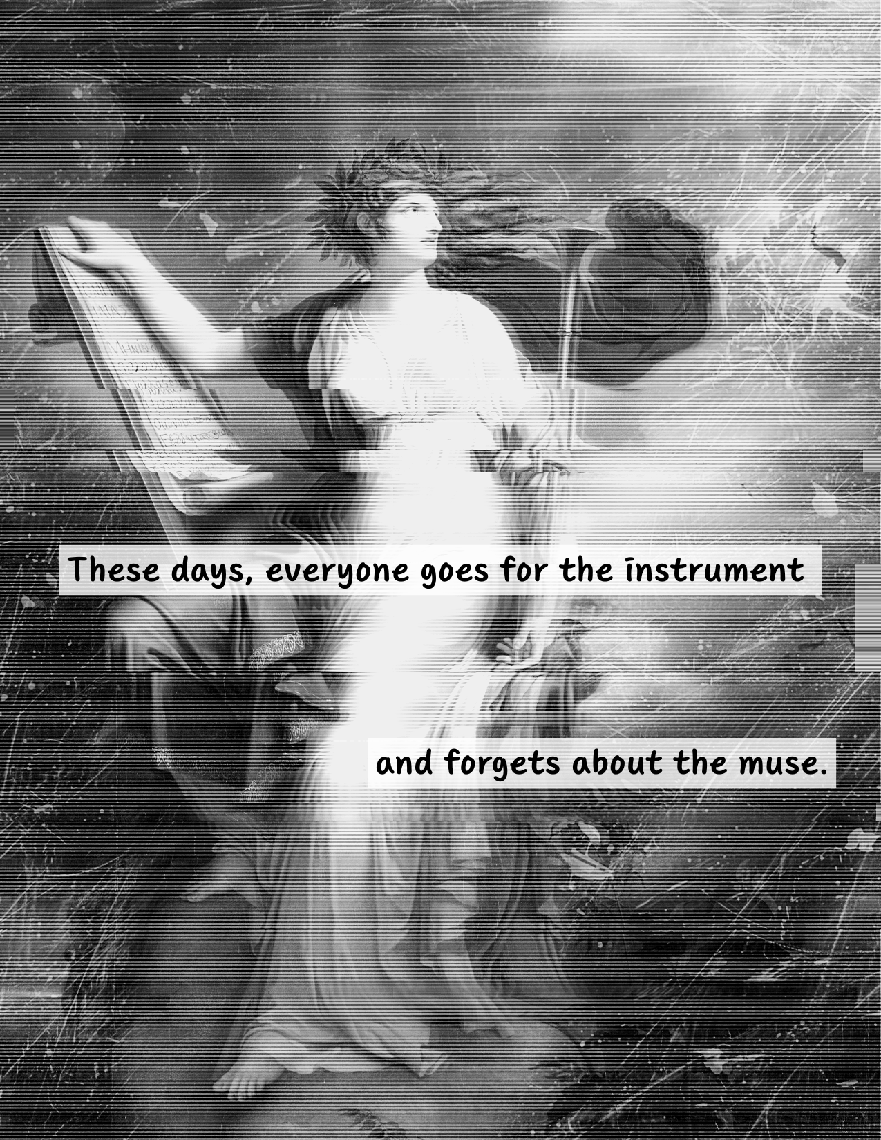
Here’s a rundown of my process for making this page:
Searched for images on Unsplash. (See image credits at the end of this post.)
Uploaded the muse image to Canva to convert to black and white and edit the background. Downloaded as png.
Opened the edited version in Affinity to add the texture image. Downloaded as png.
Went to Pixlr and opened the edited image. Added the glitch filter and adjusted settings. Downloaded as png.
Uploaded the edited version to Canva. Added text. Downloaded as png.
There are definitely other ways of making a digital collage like this. Probably with less jumping between apps. But for this collage, I went to the apps that I knew could do the work I wanted. Streamlining the process wasn’t my priority.
Images credits:
Calliope, Muse of Epic Poetry 1798 Charles Meynier (French, 1768–1832) France, late 18th-early 19th century oil on canvas Overall: 275 x 177 cm (108 1/4 x 69 11/16 in.) Severance and Greta Millikin Purchase Fund 2003.6.4 (public domain)
Here’s a quick video that shows how I use a pencil mug to flatten my zines. Very simple, low-tech. But I’ve gotten a few questions about it, so I thought it was worth showing.
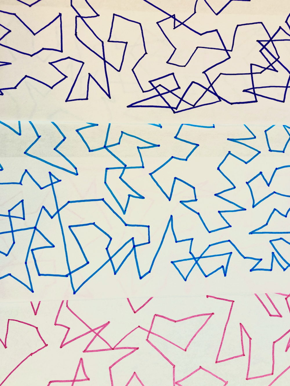
I drew some background pages for a new zine I’m working on.
Pretty simple process.
Draw a lot of random dots on a piece of paper.
Draw straight lines to connect dots. I change direction when going to a new dot. It’s okay to cross over an existing line, but I do not go through an exisiting dot.
Here’s what I do for test printing zines, which is the stage in my zine-making process between text and images are done and everything looks good to go.
Step 1
I realize I’m done with writing and visuals. I do a little happy dance (in my head) because the hard part is over.
Test prints are tedious. Folding zines can be tedious. But I don’t consider that hard work. The hard work is going from a blank page to a page that’s covered in Stuff, in the ways you wanted to cover the page with Stuff.
Step 2
I print one copy of the zine on standard copy paper. Plain white, 20lb paper. Nothing fancy. I don’t adjust any settings.
I fold the zine and look at each page. In this step, I’m looking at spacing. Is anything cut off? Anything that needs to be moved a bit? If I have something centered, does it actually look centered on the folded zine?
Next I’ll read through the zine once, front to back. I read out loud so I can hear if a sentence sounds awkward or too long.
I look for spelling and punctuation mistakes.
I mark up edits with a pen, so I know what to adjust when I’m back on my computer.
I should note an important thing: I try not to make edits on paper and on the computer at the same time. I make edits on paper first. Then I go to my computer and make edits to the file.
Step 3
I make edits on the computer, following the notes I marked on paper.
I print another test copy and fold the zine.
This time I’m looking for anything at all that needs to be tweaked. Wording, spacing, alignment.
I read the zine in reverse, back to front, bottom of each page to the top. It’s a tip I picked up in college to help catch mistakes – read your work sentence by sentence, but in reverse. From the end to the beginning.
I mark up changes in pen.
I repeat step 3 as many times as I need to, until I’m happy with everything in the zine.
Step 3.5 (optional)
Sometimes I decide to rewrite at least half the text at this point. The outcome is better writing, a better zine. But ugh, rewrites can feel tedious. Maybe I have to re-do spacing or re-think images I’m using.
I keep telling myself, this will result in a better zine.
Go back to step 3.
Step 4
I print one copy of the zine on the paper I want to use for all the copies. For mini zines, that’s usually 24lb paper. Just a little thicker than standard copy paper, so it feels nicer. Sometimes I bump up to 32lb paper. That feels like a special occasion.
I fold the zine and do a final check that everything looks good.
Then I print copies. I usually make 10-15 copies. I give away some copies to friends. I end up trading a few copies. And I put 5 copies in my Etsy shop.
And then I’m done.
Pretty straightforward process, as long as I don’t get caught in too many rewrites.
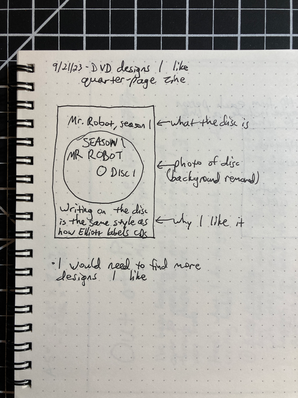
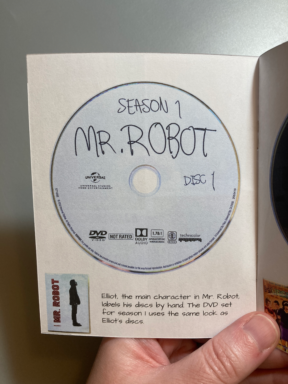
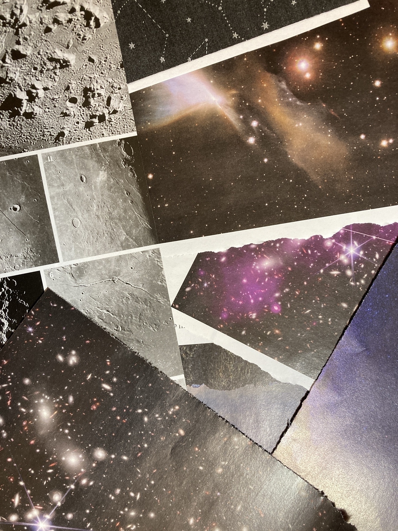
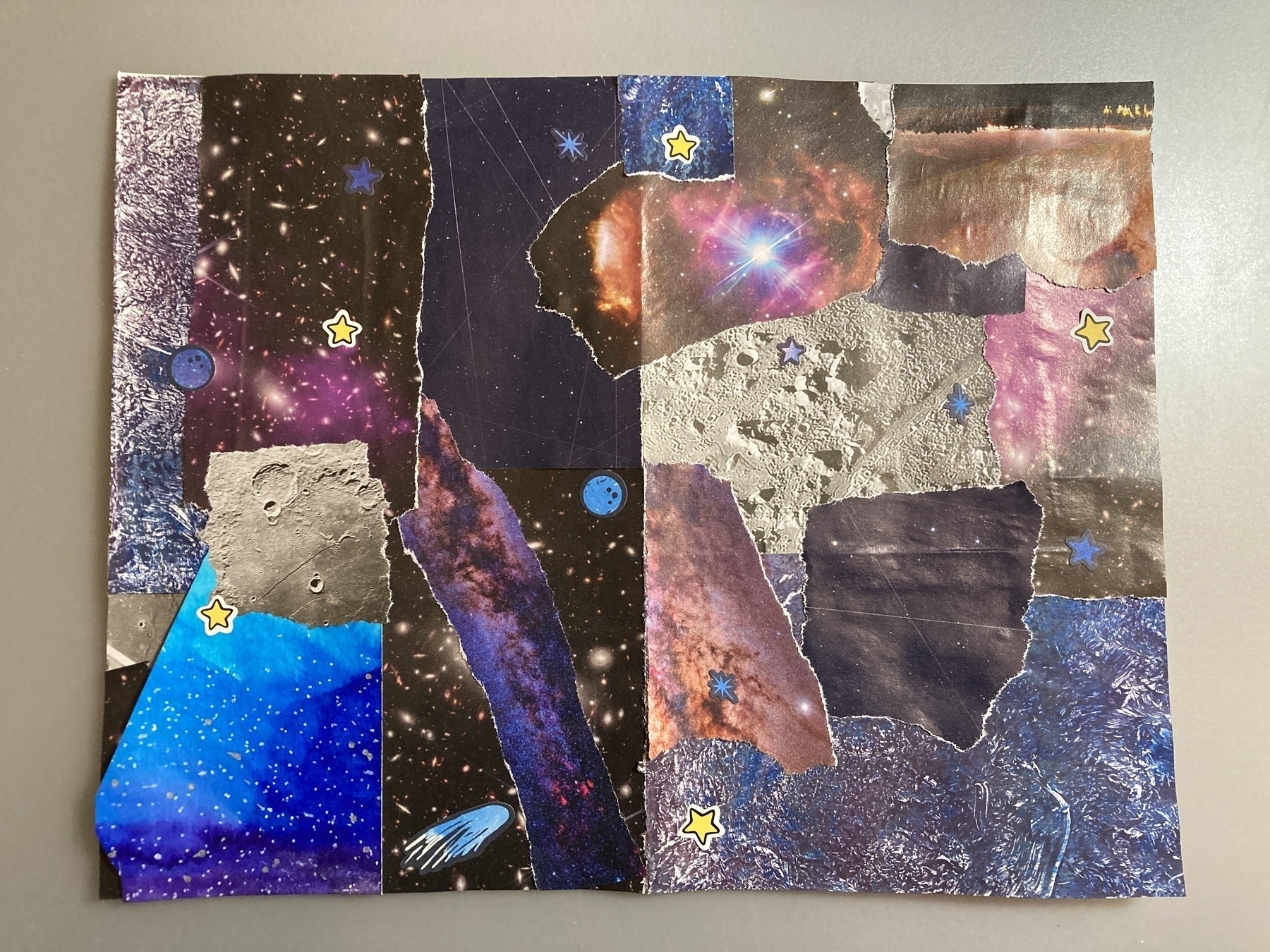
I’m working on a new mini zine about astronaut food. For the background, I wanted to collage a bunch of images of stars, the night sky, and related textures.
I collected images out of an issue of Astronomy magazine, and I gathered some illustrations and scrapbook paper I had.
Here’s a photo of some of the images.
Here’s a photo of what the collage looks like.
Next I’ll scan this into my computer, add more images digitally, and then add text (…which I still have to write).
I’m working on a new zine, and I want to share some process pics with you. 🙂 I’m making pages with black and white illustrations and then using washi tape to make collage elements.
Here’s how I’m doing it.
Draw the picture in black ink.
Lay a piece of tracing paper over the drawing. With a pencil, outline the area where washi tape will go. For this page, I wanted a curved shape around the planet.
Use washi tape to cover the area outlined in pencil. I kept even lines of tape but you could overlap pieces or rip the tape into smaller pieces.
Flip the tracing paper over. Use scissors to cut along the pencil line.
“So You Met Your Past Self” includes tips for what to do when you meet a past version of yourself. This fictional zine is a handy guide for the time traveler in your life (even when that’s you).
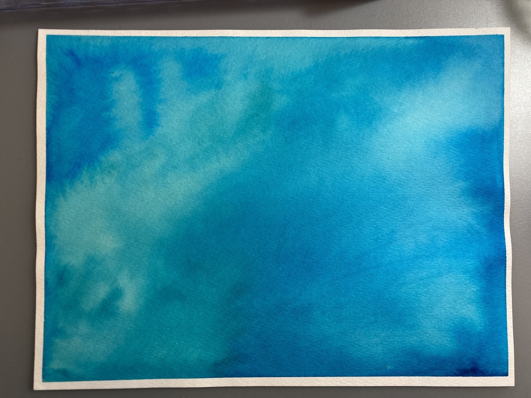
I made the background for this zine by hand. I diluted blue fountain pen ink in water. Then I painted the ink on to watercolor paper.
After the paper dried, I drew an abstract design with a dark blue marker and white gel pen.
This kind of line drawing is a technique I learned from Katie Gebely.
First you draw dots on the page, at random. Then you connect the dots with straight lines. That’s what I did with the dark blue marker. Then I added shorter lines in white gel pen.
I made tutorials that show how to set up a design file in Canva to make an 8-page mini zine. The tutorials go over how to set up guides and what the page order will be. Everything in the tutorials is done with the free version of Canva.
When I worked on my zine, Timers for Travelers, I finished the writing first. I knew I wanted illustrations throughout the zine, some hand-drawn and some digital. I decided to lay out the zine in Canva so that I could combine text, digital elements, and hand-drawn elements.
I’m really happy with how the zine came out, so I want to document my process. This is less a tutorial of Canva and more a walk-through of how I used it to put together my zine.
Canva is a free tool for graphic design. Although there are paid tiers, everything in this post was done with the free version. You can use Canva directly in an internet browser and there are apps you can download, too. If you haven’t used Canva before, you’ll need to create a free account.
Create a new file in Canva
Click on the Create a new design button and then click on Custom size. Enter the dimensions for your zine pages. For example, a quarter page zine would be 4.25 inches wide x 5.5 inches high. This file becomes your working file.
Make your zine
Make the pages of your zine with whatever method works for you. You can write text directly in Canva. I find it easier to do all my writing first in a word processor (I use Google Docs) and then copy and paste text into Canva.
Canva has a lot of graphic elements and images you can use for free. All the photos available in Canva are stock images from Pexels and Pixabay, and they are royalty-free.
Since you can upload images into Canva, you can draw on paper and scan pages. Then upload your drawings into Canva, and add them to your working file.
Note: Add page numbers last! If you’re making pages and don’t know what order they’re going to be in yet, don’t number pages. Instead, add page numbers after you have pages arranged in the order you want for the finished zine.
Print your zine
I like leaving my working file as is, like a draft. So when it’s time to print my zine, I make a copy of the working file (File » Make a copy). This becomes the print file.
Since the pages will be printed on 8.5 x 11-inch paper, cut, folded, and stapled, they need to be arranged in the correct order for printing.
To figure out the print order of the pages, I make a mock-up version of the zine with scrap paper. There are lots of ways to do this. Here’s how I figure out page order.
Go to the print file in Canva and rearrange the pages for printing. You can drag and drop pages or use the up and down arrows above each page to change where they are.
When I’m moving a lot of pages around, I like working in grid view. Click on the button in the bottom right of the screen that looks like a stack of papers with a number on it.
When you’re done arranging pages, download the print file as a PDF. Click on the Share button (top-right). Then click on Download. For “file type,” choose “PDF Print.”
Open the PDF file on your computer. Go to print settings. Find the option for pages per sheet, and change this to 4. This will print 4 of your zine pages on one 8.5 x 11 piece of paper. Make sure two-sided printing is selected.
Print your zine. Cut the pages in half horizontally and then fold them. If you ordered the pages correctly in Canva, then the pages should be in the correct order when you assemble them as a booklet.
How do you arrange zine pages so they print in the correct order? There are lots of ways to do this, depending on the size of your zine and the number of pages. Here’s one method for quarter-page zines.
Shout-out to Ryan at Pocket Thoughts. His method for printing quarter-page zines is the first one I learned. What I have below is similar to the way he does it.
Here’s how I determine page order for printing zines.
This example is with a quarter-page zine where the cover is blue cardstock and the interior pages are standard white copy paper.
Printing a quarter-page zine on 8.5 x 11-inch paper means that you have 4 zine pages on the front of the sheet of paper and 4 zine pages on the reverse side of the sheet. So that you don’t have (unintentional) blank pages, your total number of zine pages should be a multiple of 4.
I make a paper dummy (aka mock-up) to figure out the page order. The process might be difficult to follow in writing, so I made a video explaining my method. The rest of this post is the method written out.
To make the mock-up, I use scrap paper that’s the same size as what the actual zine will be printed on (8.5 x 11 sheets of paper). If you’re going to have a different paper for the cover, you can use a different color of scrap paper or just mark the paper somehow so you know that’s the cover.
Cut the 8.5 x 11-inch pages in half horizontally.
Then fold the half-sheets vertically and put them together as a booklet. You should have the same number of pages as what you want your finished zine to be. Zines with 16 pages are common, so that would be the covers plus 12 interior pages.
Don’t staple the pages since you’ll be taking them apart anyway.
Label the front cover, back cover, and interior pages.
Take the pages apart, unfold them, and lay them out as if they were 8.5 x 11-inch sheets of paper. You’ll have groupings with 2 half-sheets. Then you can see how the zine pages should be ordered for printing. Flip the half-sheets over to see which zine pages would be on the reverse side of the page. This will show you how to arrange zine pages for double-sided printing.
Depending on the number of pages in your zine or if you want to use a different type of paper for the cover, you may end up with a half-sheet on its own. In this case, for the print layout you can copy and paste the top half of the sheet to the bottom half. So on the 8.5 x 11-inch sheet of paper, the top half would be the same zine pages as the bottom half.
Take notes so you remember the page order. These can be rough since they’re just for reference when you’re arranging pages in layout.
I use “1A” and “1B” to indicate that’s one sheet of paper, front side (1A) and back side (1B). Then “2A” is the front of the second sheet of paper and “2B” is the back of the second sheet of paper.
As long as you figured out the sequence correctly, you’ll be able to print and assemble your zines in the correct page order.
“Vignettes From Camelot” includes glimpses into the lives of Arthurian characters: Merlin, Morgana, Arthur, and an unnamed messenger.
The zine is 16 pages long with 4 original stories and hand-drawn illustrations inspired by nature and magic. It’s printed in black and white. I couldn’t decide on a blue or white cover, and neither could my Instagram poll. 😂 So I made both versions.
The stories in this zine started as a series of tweets I wrote a few years ago. My original idea was to write 10 tweets in a thread and have that be one story about people in Camelot. I never finished that, but I took the ideas I had for Merlin, Arthur, Morgana, and a messenger and fleshed them out into these vignettes.
I drew the illustrations by hand using black and gray markers and pens. I wasn’t sure which illustrations would go with which stories, so I drew each page individually. Here are a few of the original illustrations.
When I finished all the illustrations, I scanned them so that I could do the layout digitally.
I used Canva to lay out the text and illustrations. I made many of the illustrations semi-transparent so that the text over them was readable. In some cases, I put white boxes behind the text, so that the words stood out without adjusting transparency on the illustration. Here are two of the pages in Canva.
After I laid out all the pages, I did a few test prints to see how everything looked on paper. I made a some adjustments, and then printed several copies for my Etsy shop.
“Photographic Memories” is a collection of illustrations, writing, and memories related to photography.
It’s a quarter-page zine and 20 pages, which makes this the largest and longest zine I’ve made to date! The zine is printed in black and white and mostly hand-made with some digital elements.
It took me a while to make this zine. I knew I wanted to focus on photography, but beyond that, I didn’t know what to include. I knew I didn’t want it to be a how-to guide or lessons on photography. You can google all that and nothing I make would be as extensive or informative.
Instead, I thought about things that stuck with me—concepts and memories—and that’s what I made pages about. Here are some previews:
I made each page individually and then laid out pages by hand. The original pages look like this:
I used sticky notes to label each page, so I wouldn’t lose track of what goes where. I scanned pages, added some white space as buffer, and then printed copies.
I learned a lot by making this zine in a larger and longer format than I’ve done before. I already have plans for my next zine. It probably won’t be as long but it’ll be the same page size.
About a year ago, I stated making zines. It was something fun to share with friends, but then the pandemic hit, and we all stayed home. I couldn’t share my zines in person, so I started posting them to Instagram. I had no expectations for how people would respond. People seemed to like them, so every time I made a new zine, I posted it.
I attended a couple online workshops and (virtually) met people who make zines. That created a small community for me, which has been great during a year of limited social interaction.
I post my zines on Instagram and my blog, so anyone can read them digitally. But if anyone wanted a physical copy, there wasn’t an easy way to get one. Last August, I started an Etsy shop. Again, I had no expectations.
This week, I got a message about this zine:
A librarian who purchased Text Message Moods asked if she can use it as an example in a student workshop. I said yes because 1) it’s an opportunity to support education and 2) that’s super cool! A year ago, I would have never thought something I made would be in a workshop for students across the country.
It started with me making zines for friends.
Then I posted zines to Instagram.
Then I found more people who make zines.
And then someone who saw my zines reached out to me.
All of this to say—If you’re working on something (writing, art, poetry, film) and you aren’t sure how it’s going to go…share it anyway. You don’t know if people will like it until they see it. You can’t guess what connections you’ll make through your work.
Put your creative work out there, and see where it goes. It might lead you somewhere surprisingly good.
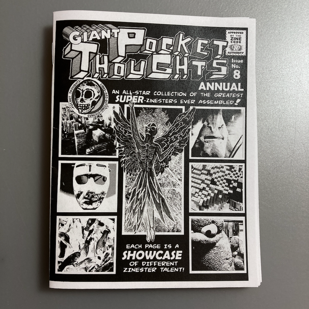
I contributed a page to Pocket Thoughts Annual #3, a collaborative zine that features 25+ zinesters from around the world. Each contributor was welcome to do whatever they wanted with their page. I made this astronaut illustration:
I wanted to go for a collage look, but still where I made each part of it. This is what the elements looked like, before I put the page together:
I started with black cardstock and a white gel pen for the stars in the background. If you’ve seen my space-themed illustrations, you know I love drawing stars on black paper. 🙂
I drew the astronaut on white cardstock and the…cloud thing on black cardstock with a black fineliner and white gel pen. Then I cut those out.
The white strips on the left of the page are pieces of white cardstock.
II printed the text using my Phomemo printer. It’s so handy for little things like this!
And then I glued everything into place. To send it in for the zine, I scanned it, so I could send a jpg.
Making this page took a while since I created each element separately, but I’m really happy with how it came out.
I wanted to do a space and sea theme for a while, but I was stuck on the words. And then NASA found water on the moon.
I love how the colors, text, and illustrations came together. If you want to read about my process for this zine, keep scrolling after the images. 🙂
I started with a white sheet of cardstock and used blue and black stamping inks to build the background colors.
The blue ink is distress oxide ink, so it reacts with water. After the blue and black inks dried on the page, I sprayed the blue area with water and used a clean brush to move the water around and add some texture. Then I let it dry completely. I drew the seaweed and everything else in the blue area with Tombow dual brush pens.
I drew the stars and moon in the black area with a white gel pen.
Full disclosure: I wanted to draw little Daleks and built the rest of this zine around them.
Bonus material
Planning
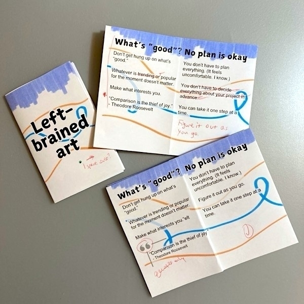
If I don't quite know what I want to write or draw, I plan out the zine on one page, like so:
This acts as a rough draft of my zine, so I can sort out what I want on each page.
Guiding
I like to work on zines with the page unfolded, so I use small sticky notes to label each page, like this:
This lets me work on pages in whatever order I want, without losing track of the order in the folded zine. And, having the page unfolded means I don't have to worry about ink bleeding through to another page.
A handy little zine for how to identify potential time travelers.
To make the background for this zine, I started with white cardstock paper. I used distress oxide inks (3 shades of blue) and blended them on the paper with a sponge applicator. This ink reacts with water, so I used a gear stencil and traced the gear shapes with a brush and plain water. That's what made the sort of ghost-looking gears. I used watercolor brush pens with the stencil to create the darker blue and purple gears. The blue and orange clock faces (most of the cover page and the clock faces on the inside pages) are scrapbook paper that I happened to have and fit perfectly. :)