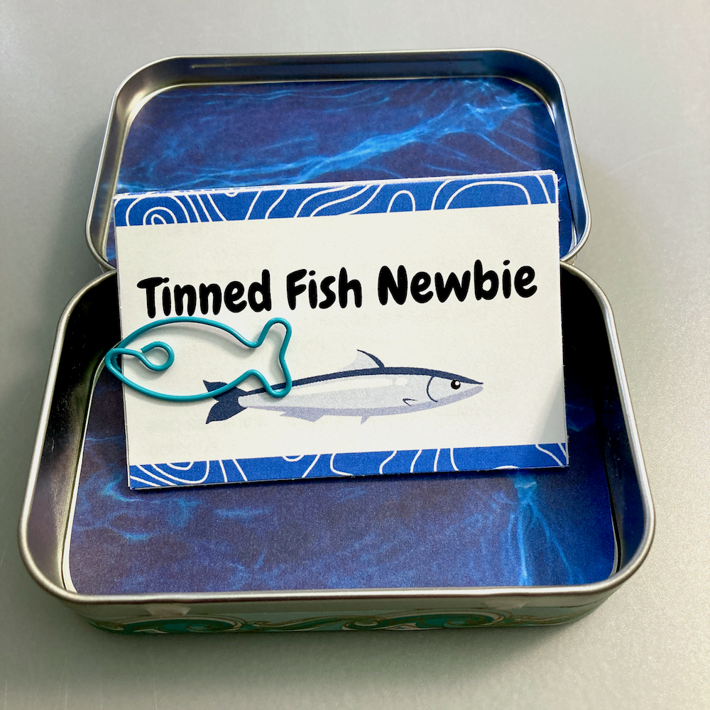
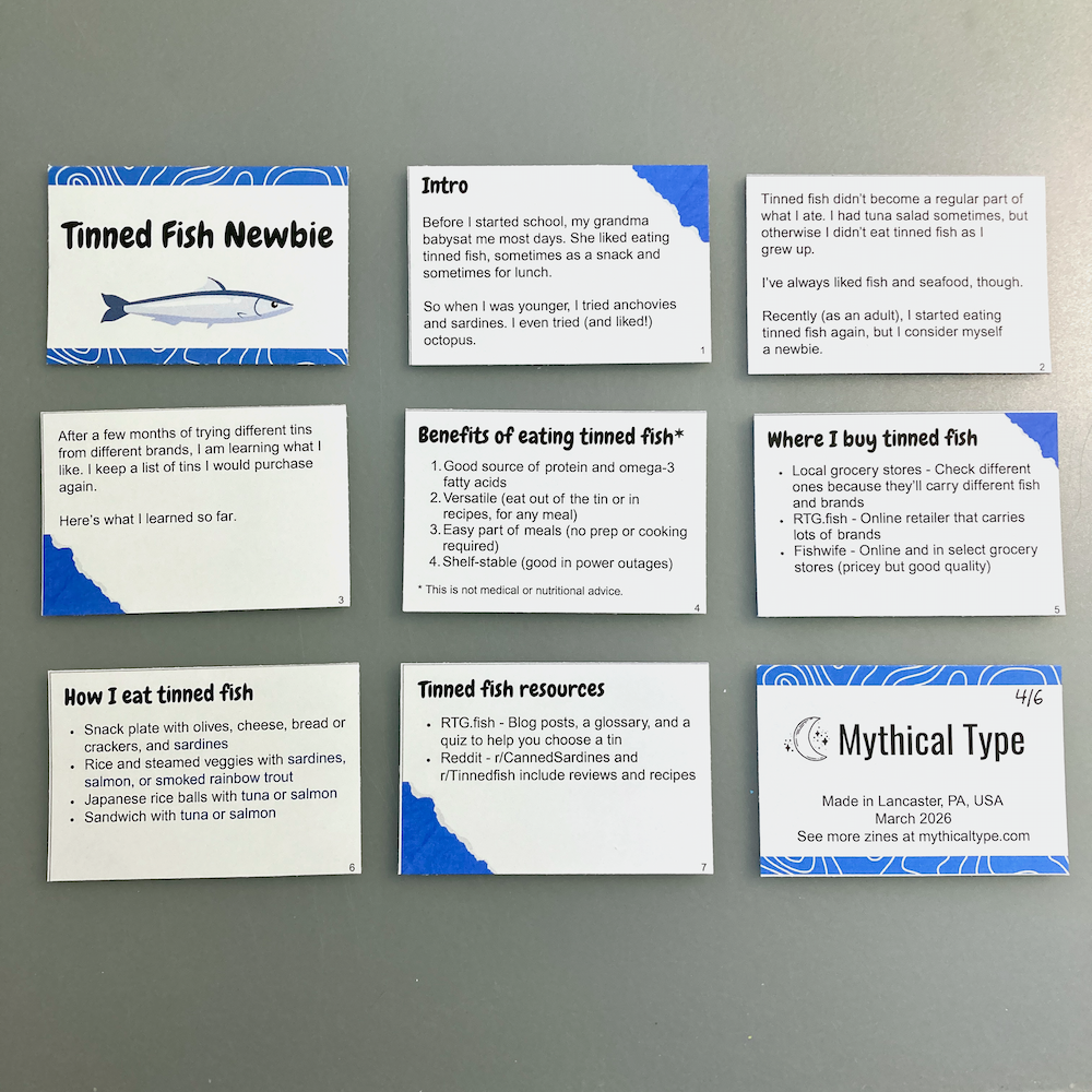
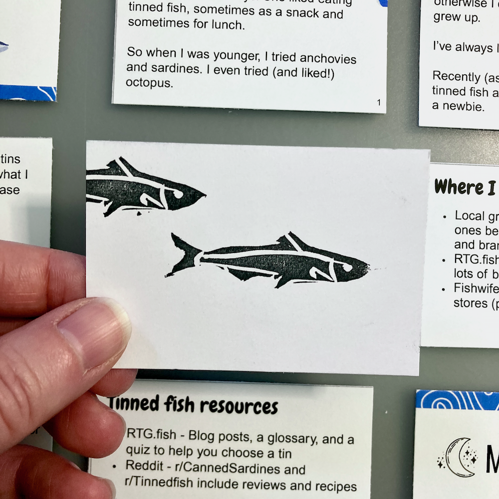
“Tinned Fish Newbie” is a tiny zine about the tinned fish I’ve been trying the past few months.
Nine pages held together with a fish paperclip (it’s cute!), inside a decorated Altoids tin. Each tin is decorated a little differently, and the stamped fish page varies. But the zine is the same.
This is a limited edition. I made 6 (and I’m keeping 1 🤭), so 5 copies will be available exclusively at Lancaster Zine Fest — April 18 in Southern Market (Lancaster, PA).
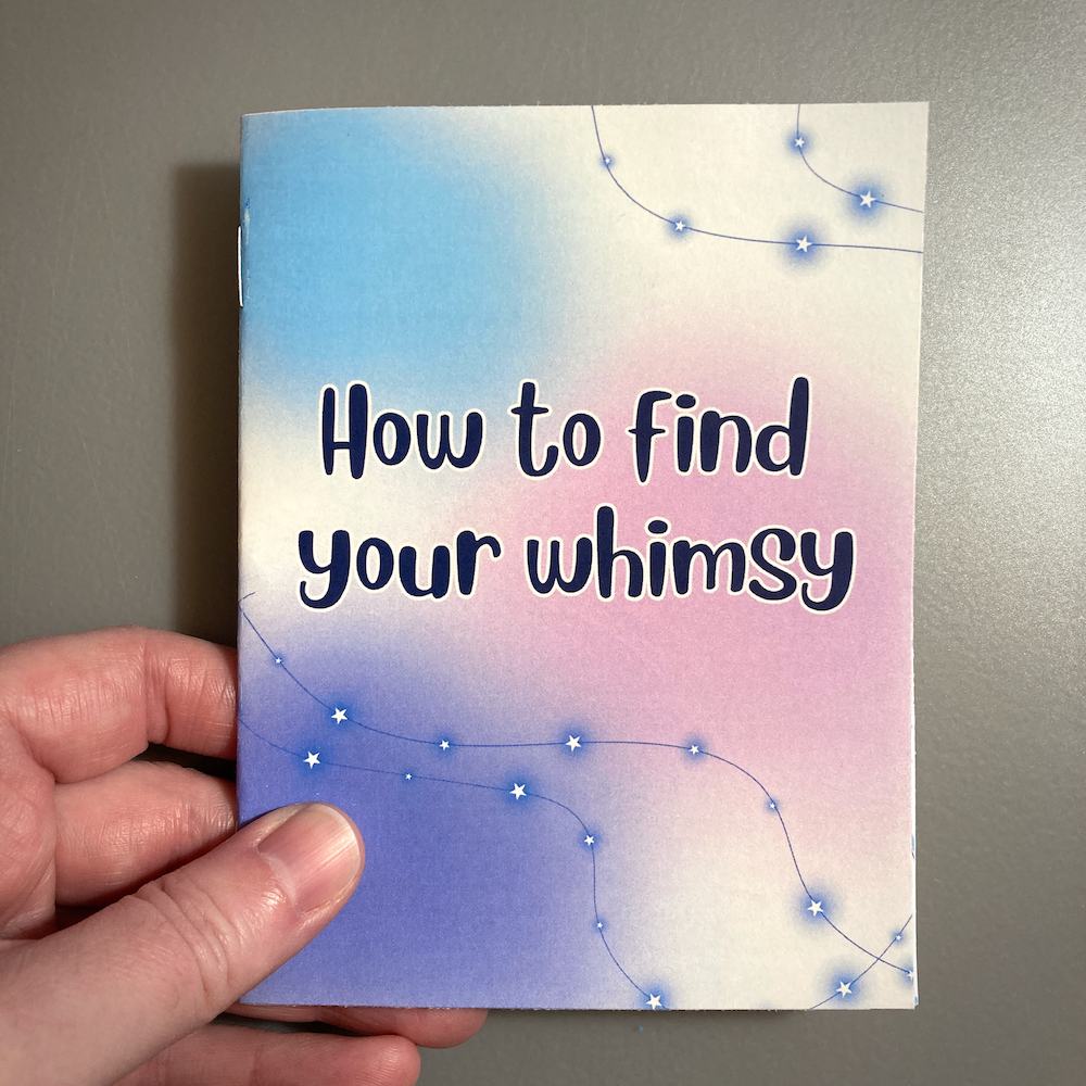
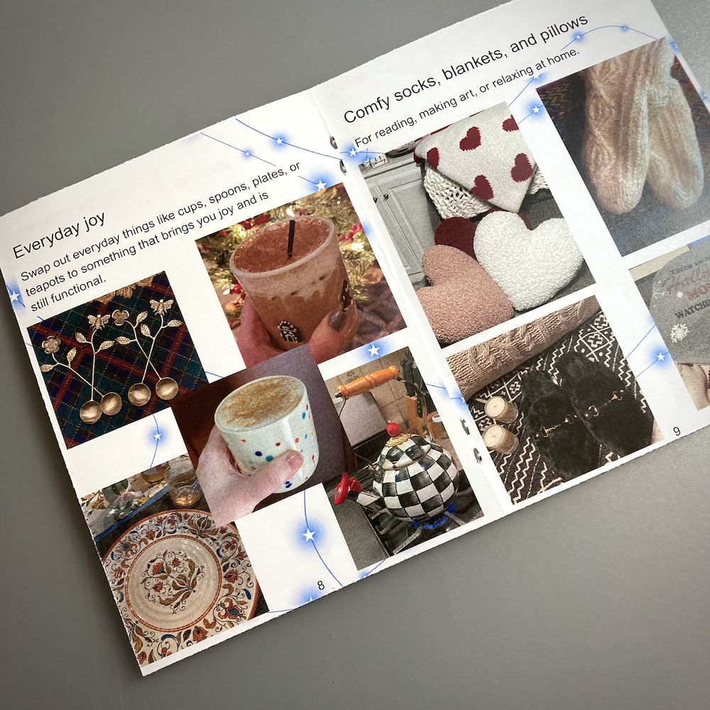
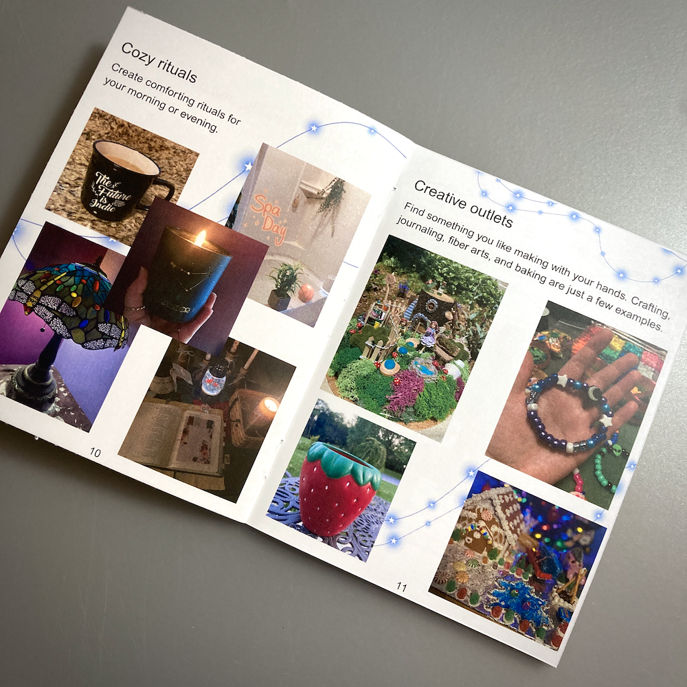
“How to find your whimsy” is a zine that includes a variety of ideas and photos for adding everyday joy to your life. ms.writteninthestars and I made this together!
Printed copies are available in my Etsy shop (U.S. only) and via trading (anywhere mail can go).
Details:
16 pages (including covers)
Finished zine measure 5.25 inches high x 4 inches wide
Covers are printed in full color on white cardstock
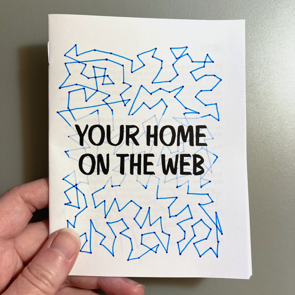
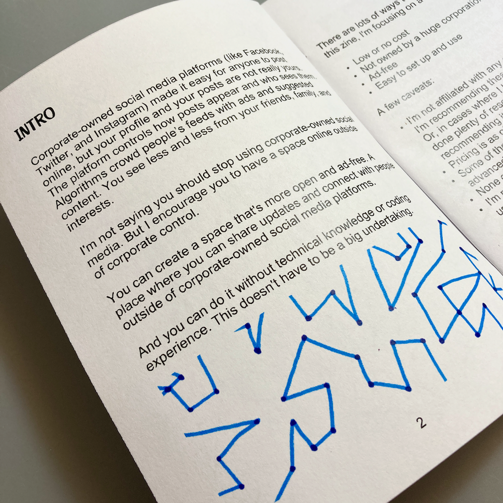
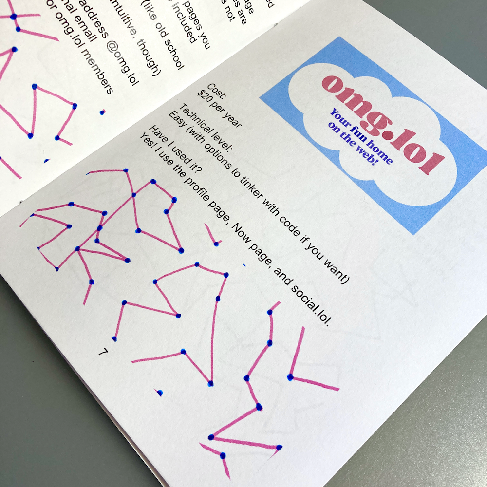
New zine! 💫 “Your Home on the Web” is a 16-page zine about low tech, low cost ways to make a simple website or blog. Notes for each platform include a description, key features, and pricing.
The zine encourages you to have your own space on the internet, away from mainstream social media platforms.
Details:
16 pages (including covers)
Finished zine measure 5.5 inches high x 4.25 inches wide
Printed in full color on white paper
Folded by hand and bound with staples
How to read this zine:
Physical copies are available in my Etsy shop (U.S. only 🇺🇸)
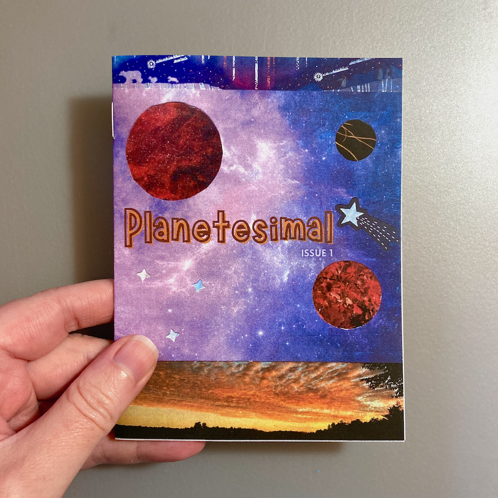
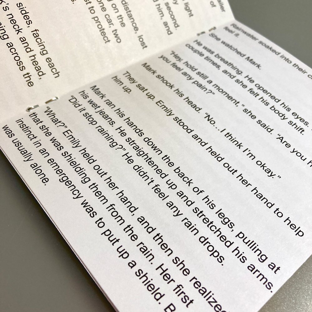
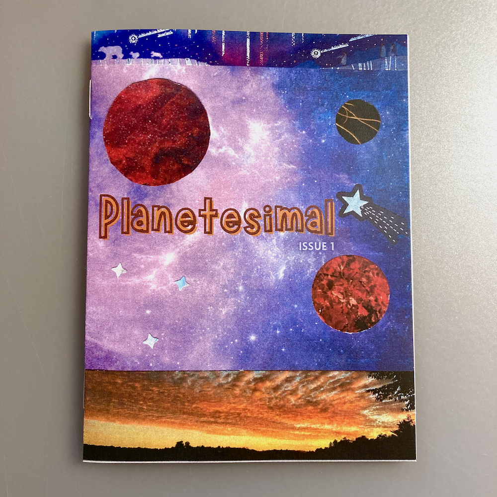
Planetesimal is a zine series where each issue includes flash fiction. Some stories are interconnected while others stand alone.
Issue 1 includes one story, “The Accident.”
Emily recently discovered she has special abilities related to weather and nature. A truck accident forces her to choose between keeping her abilities a secret or revealing them to her friend, Mark. (This story originally appeared in a podcast episode for VLASINDA’s Desolate Library.)
Printed copies are available in my Etsy shop (U.S. only). I’m also open to trading (anywhere mail can go).
Zine details:
The zine cover is a handmade collage
All text is typed
8 pages (including covers)
Finished zine measure 4 inches wide x 5.25 inches high
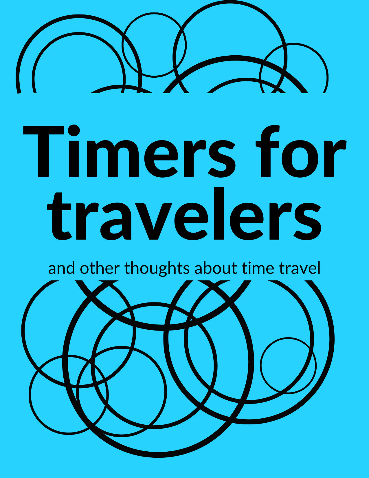
Someone on Etsy asked if I planned on making more copies of “Timers for travelers.”
I’m not planning on printing more copies any time soon, but I thought it was a good opportunity to make a digital version. The PDF version of “Timers for travelers” is now available on Ko-fi (free/pay what you want).
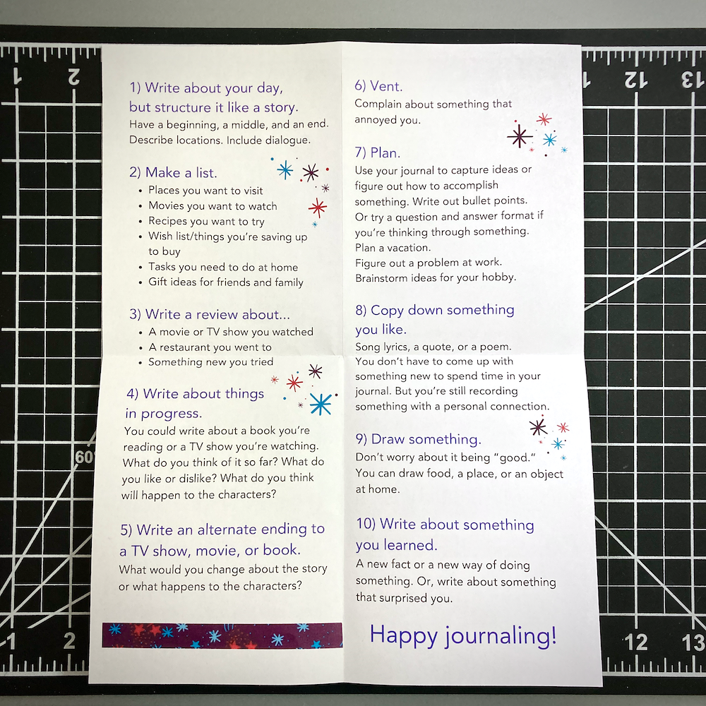
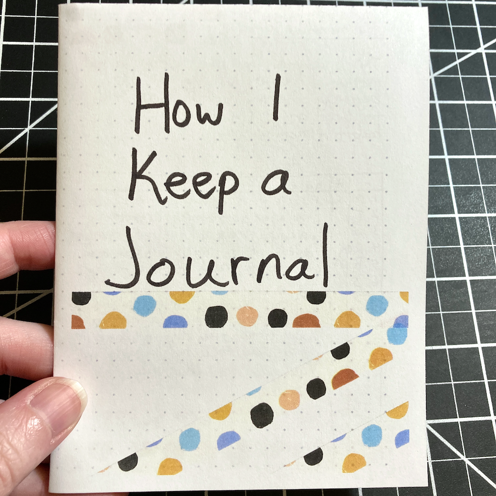
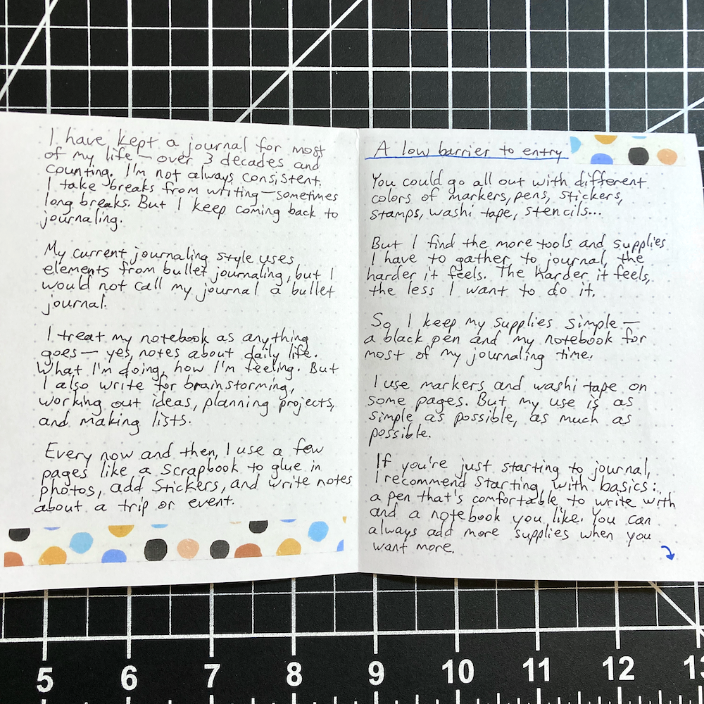
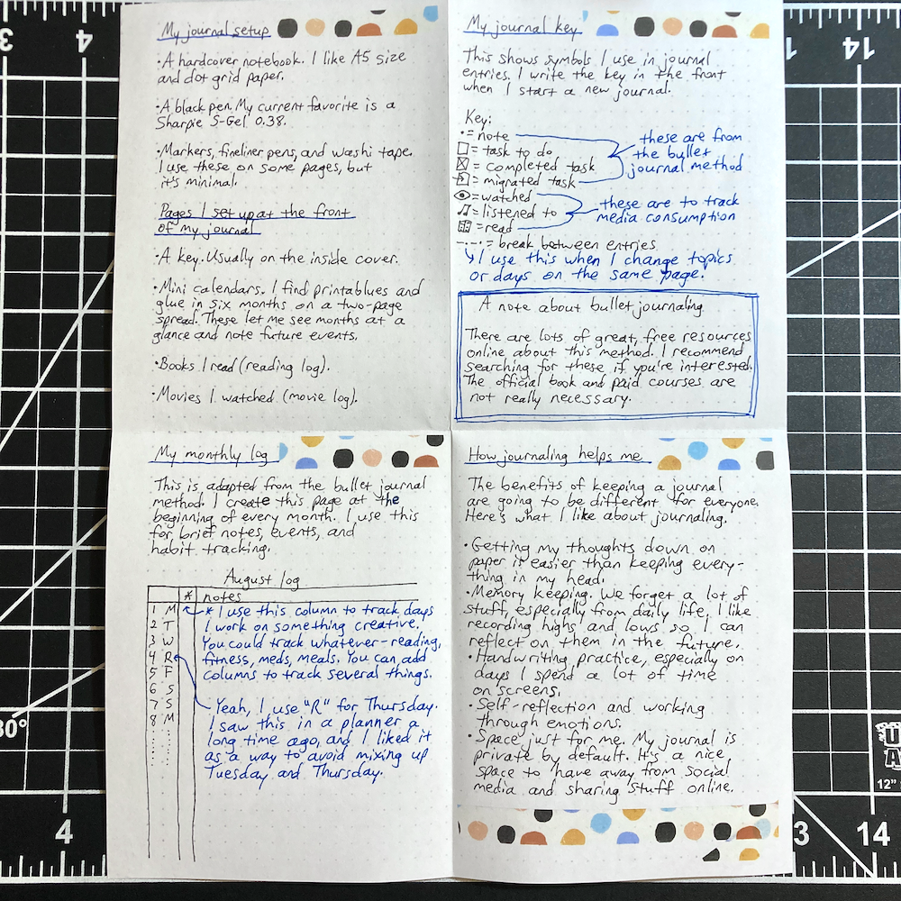
How I Keep a Journal is a zine about my journaling habit. It includes a short background on my journaling style, how I set up my notebook, and how journaling helps me. I wrote everything by hand, which is not my norm for zines with a lot of text. 😅 But it fits the journaling theme.
The zine is printed in color, double-sided, on white 8.5x11-inch paper.
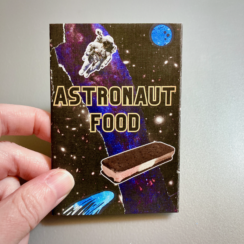
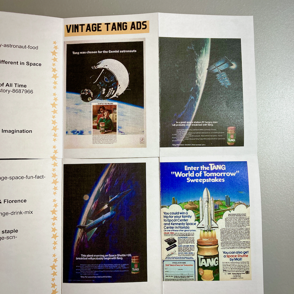
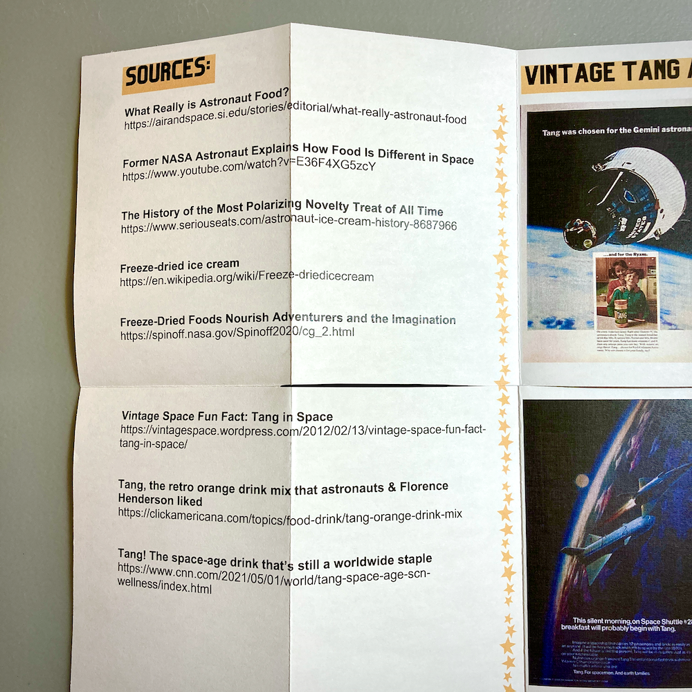
New zine! “Astronaut Food” is a mini zine about freeze-dried food that astronauts eat in outer space.
The zine includes history about developing food for NASA missions. The back side of the zine (when unfolded) shows vintage Tang ads and a list of sources.
If it’s giving Bill Nye episode, that’s my intent. 😉
I made a collage using space imagery for the background of the zine. All text is typed.
Copies are available in my Etsy shop (U.S. only), and I’m also open to trades.
See below for photos and full text of the zine.
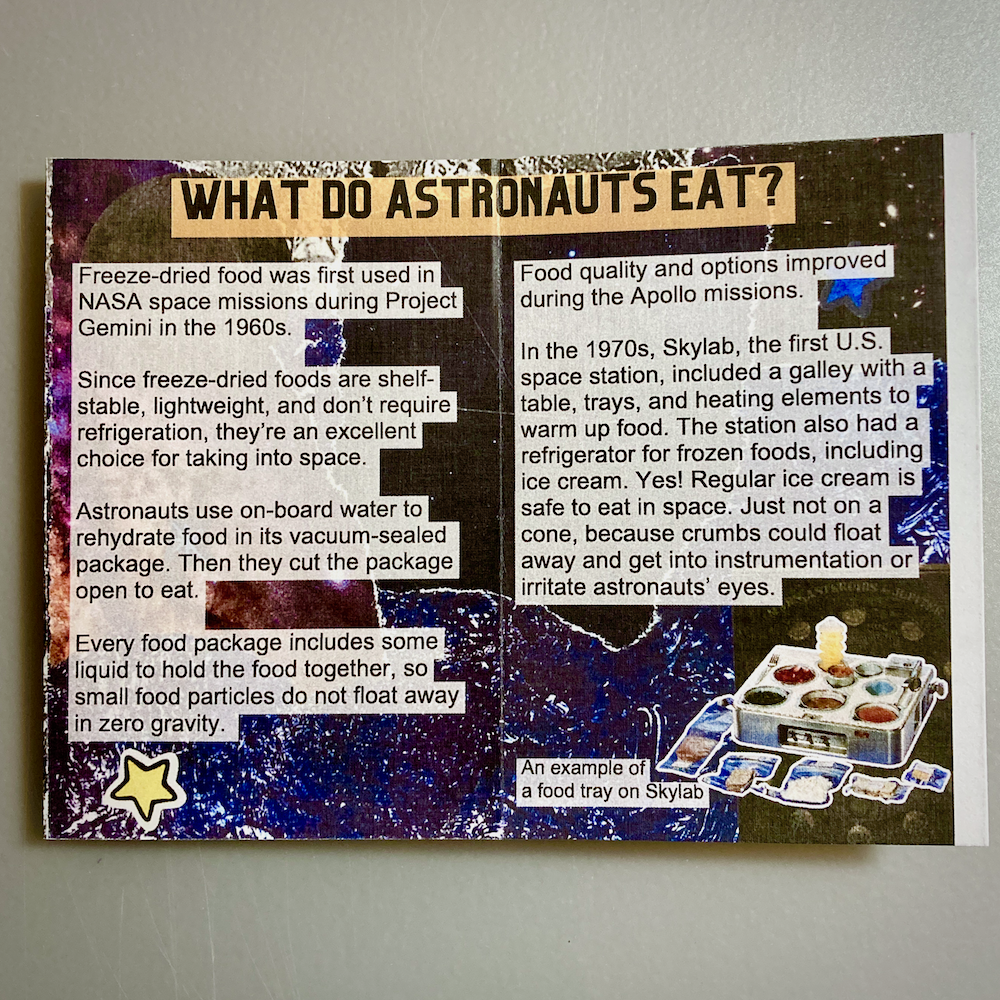
What do astronauts eat?
Freeze-dried food was first used in NASA space missions during Project Gemini in the 1960s.
Since freeze-dried foods are shelf- stable, lightweight, and don’t require refrigeration, they’re an excellent choice for taking into space.
Astronauts use on-board water to rehydrate food in its vacuum-sealed package. Then they cut the package open to eat.
Every food package includes some liquid to hold the food together, so small food particles do not float away in zero gravity.
Food quality and options improved during the Apollo missions.
In the 1970s, Skylab, the first U.S. space station, included a galley with a table, trays, and heating elements to warm up food. The station also had a refrigerator for frozen foods, including ice cream. Yes! Regular ice cream is safe to eat in space. Just not on a cone, because crumbs could float away and get into instrumentation or irritate astronauts’ eyes.
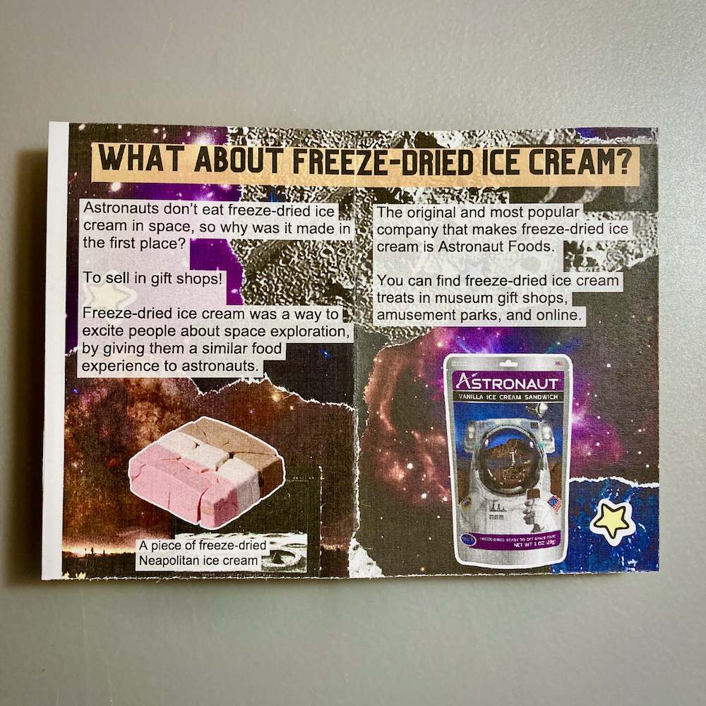
What about freeze-dried ice cream?
Astronauts don’t eat freeze-dried ice cream in space, so why was it made in the first place?
To sell in gift shops!
Freeze-dried ice cream was a way to excite people about space exploration, by giving them a similar food experience to astronauts.
The original and most popular company that makes freeze-dried ice cream is Astronaut Foods.
You can find freeze-dried ice cream treats in museum gift shops, amusement parks, and online.
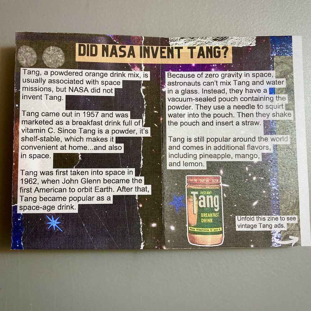
Did NASA invent Tang?
Tang, a powdered orange drink mix, is usually associated with space missions, but NASA did not invent Tang.
Tang came out in 1957 and was marketed as a breakfast drink full of vitamin C. Since Tang is a powder, it’s shelf-stable, which makes it convenient at home…and also in space.
Tang was first taken into space in 1962, when John Glenn became the first American to orbit Earth. After that, Tang became popular as a space-age drink.
Because of zero gravity in space, astronauts can’t mix Tang and water in a glass. Instead, they have a vacuum-sealed pouch containing the powder. They use a needle to squirt water into the pouch. Then they shake the pouch and insert a straw.
Tang is still popular around the world and comes in additional flavors, including pineapple, mango, and lemon.
I make zines for fun, and I want zines to be primarily for fun, so I don’t set specific goals each year. Even so, I’m really happy with what I accomplished in the past year!
Here’s a rundown of zine-related things I did in 2024.
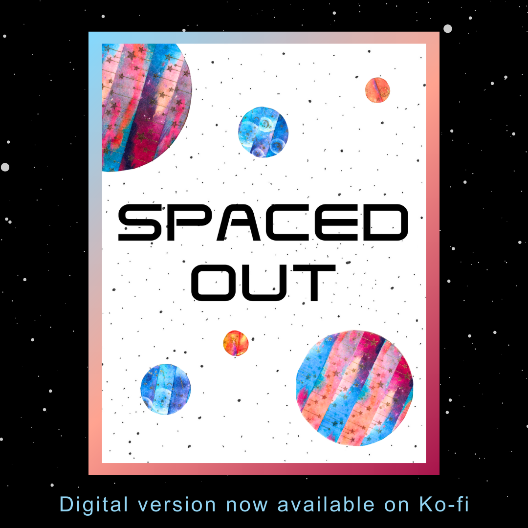
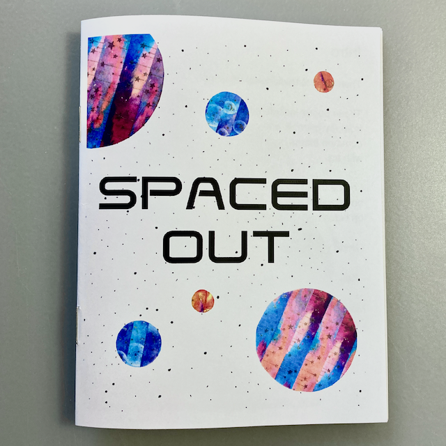
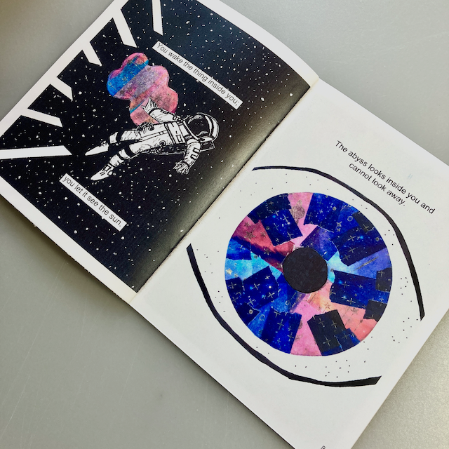
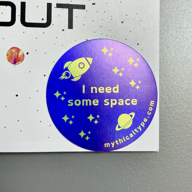
I made holographic stickers to go with this zine! This is an updated design of my “I need some space” stickers. Every physical copy of “Spaced Out” comes with a sticker.
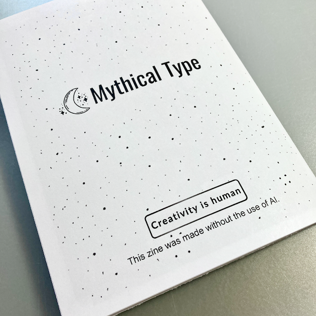
I added a note to the back of my zine about not using AI.
I’ve been seeing some artists clarify that they don’t use AI in their work, and I think it’s an important distinction to make. I already have a webpage about why I don’t use AI. Now I have a note in print, too.
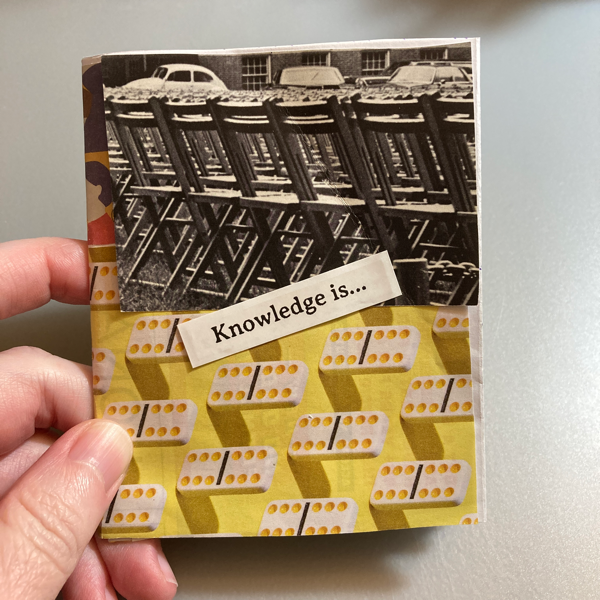
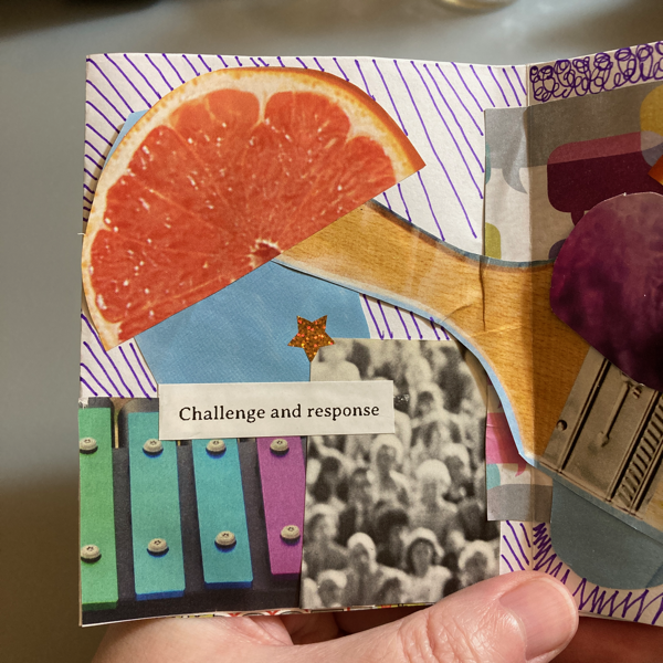
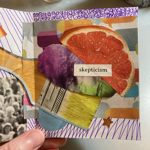
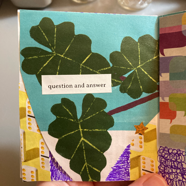
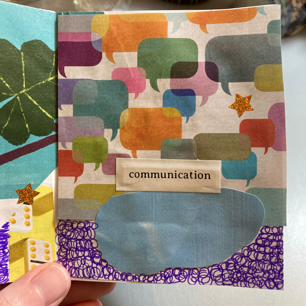
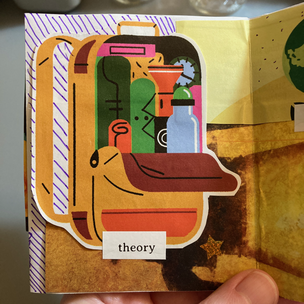
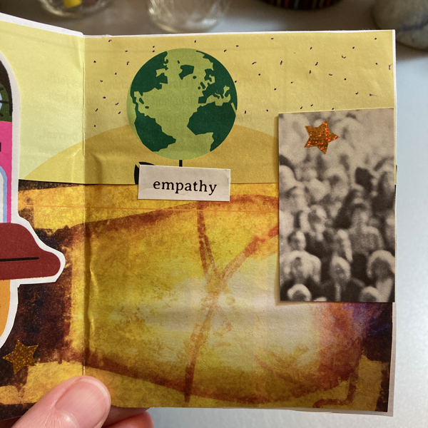
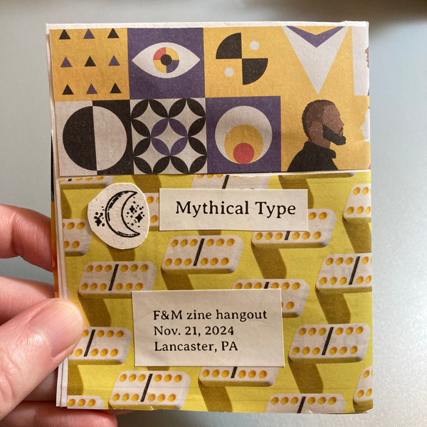
Here’s a collage zine I started at a local zine hangout on Thursday and finished tonight.
I like experimenting during zine-making events, so this style is very different from the zines I usually make.
The images are pretty random. 😂 I was looking more at colors and patterns, with less regard for items in each image. Text is inspired by old card catalog entries (cards were on the tables, among archival materials available to use).
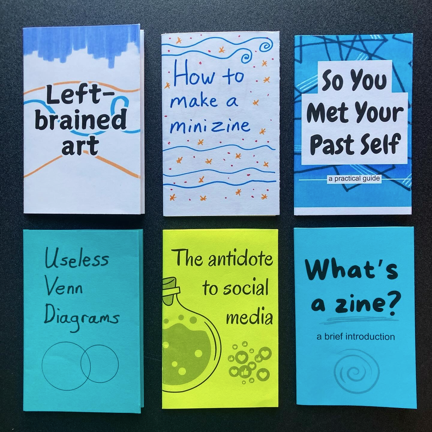
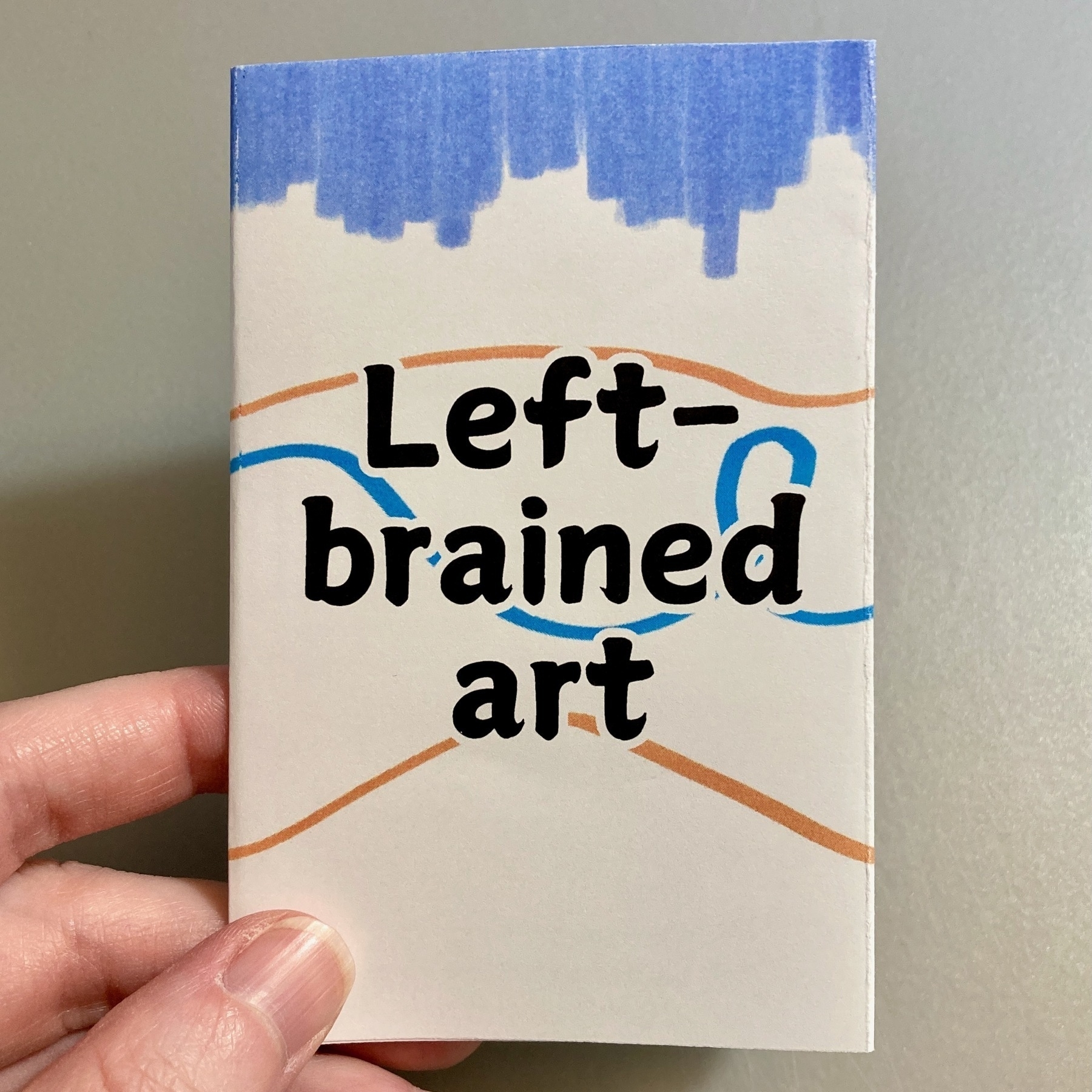
“Left-brained art” is a mini zine that includes tips for how to make art without having to plan all the details up front. Each page includes a tip and brief explanation.
This zine encourages you to work with the materials you already have and not worry about what people will think of the finished work.
I drew the background by hand with markers. Layout and text in Canva.
Copies are available in my Etsy shop (U.S. only). I’m also open to trading! (Message me.)
Full text in the zine:
Front cover
Left-brained art
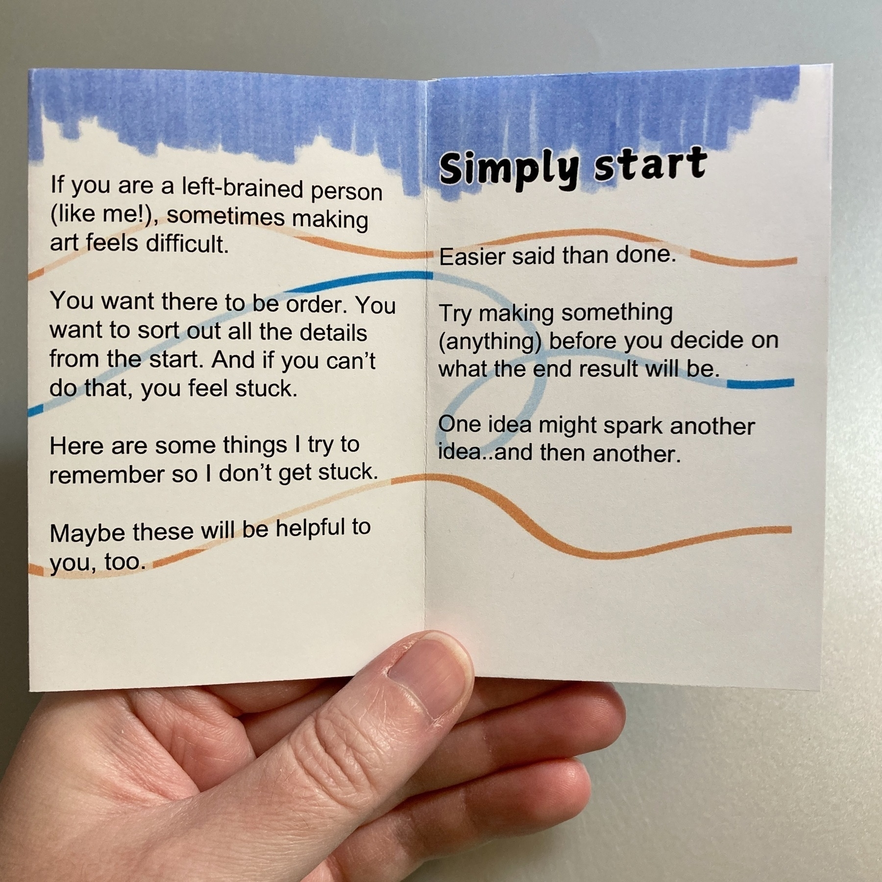
Page 1
If you are a left-brained person (like me!), sometimes making art feels difficult.
You want there to be order. You want to sort out all the details from the start. And if you can’t do that, you feel stuck.
Here are some things I try to remember so I don’t get stuck.
Maybe these will be helpful to you, too.
Page 2
Simply start
Easier said than done.
Try making something (anything) before you decide on what the end result will be.
One idea might spark another idea..and then another.
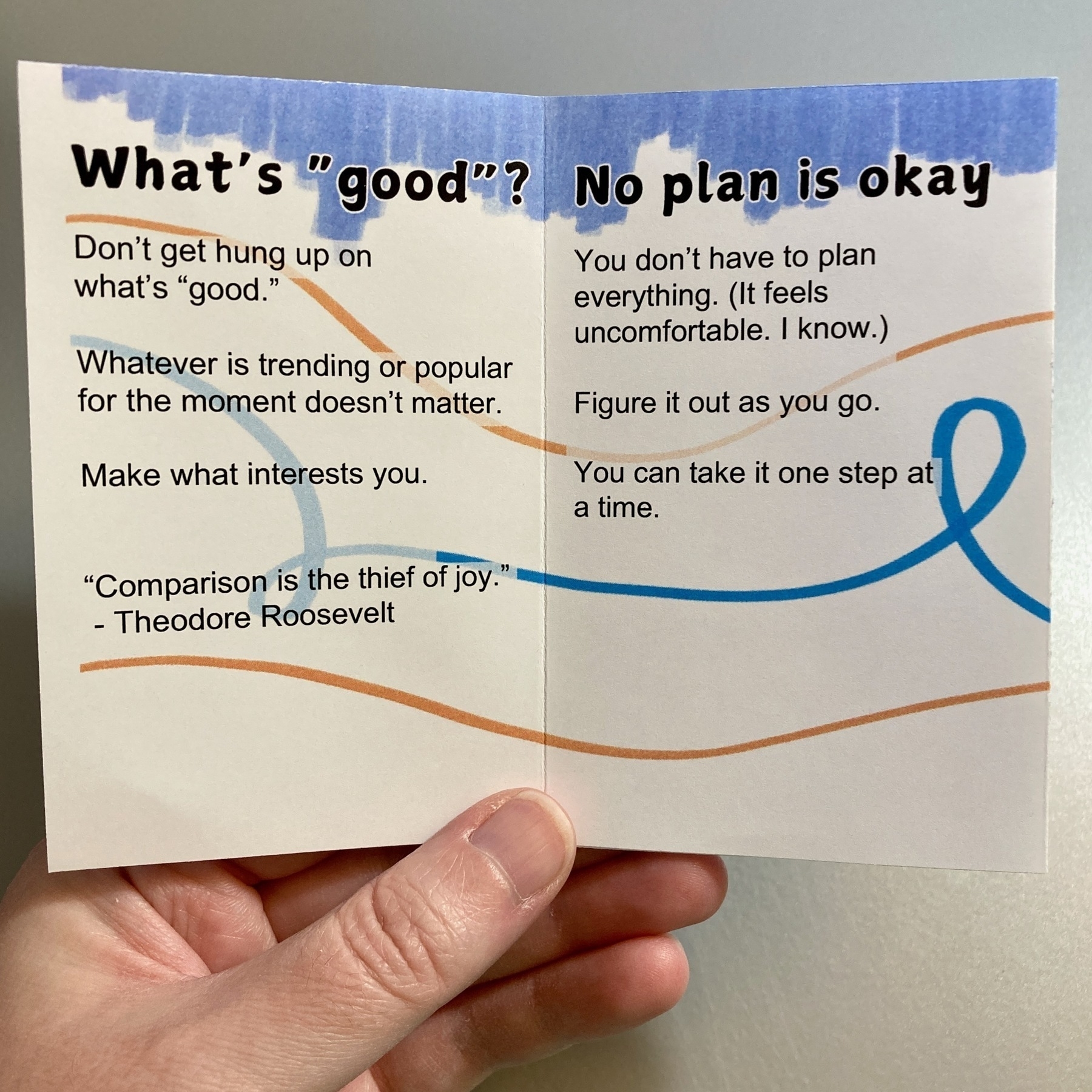
Page 3
What’s “good”?
Don’t get hung up on what’s “good.”
Whatever is trending or popular for the moment doesn’t matter.
Make what interests you.
“Comparison is the thief of joy.”
– Theodore Roosevelt
Page 4
No plan is okay
You don’t have to plan everything. (It feels uncomfortable. I know.)
Figure it out as you go.
You can take it one step at a time.
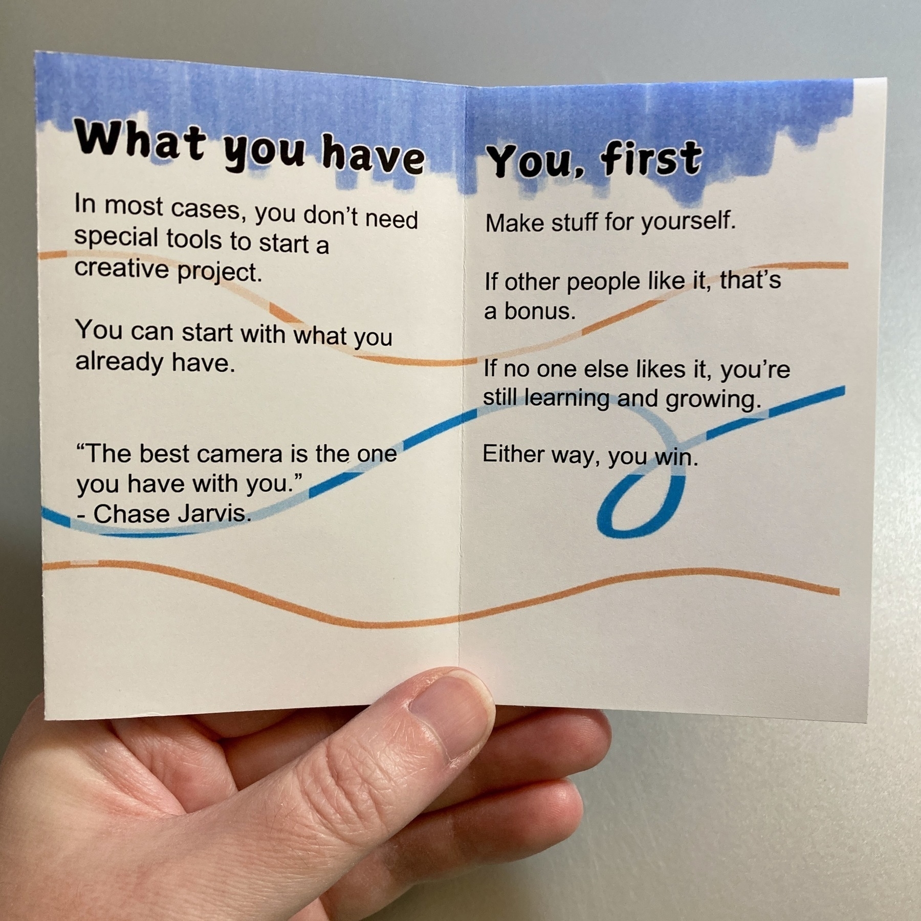
Page 5
What you have
In most cases, you don’t need special tools to start a creative project.
You can start with what you already have.
“The best camera is the one you have with you.”
– Chase Jarvis
Page 6
You, first
Make stuff for yourself.
If other people like it, that’s a bonus.
If no one else likes it, you’re still learning and growing.
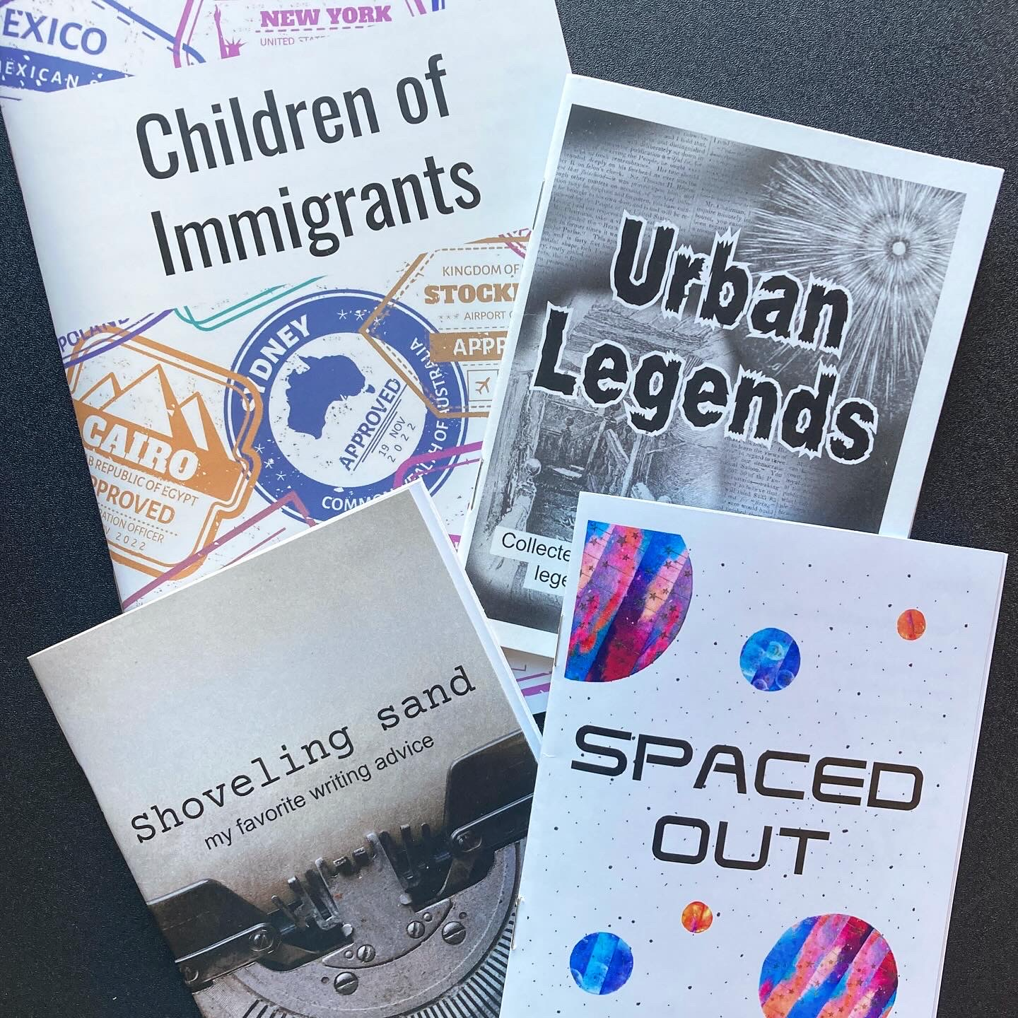
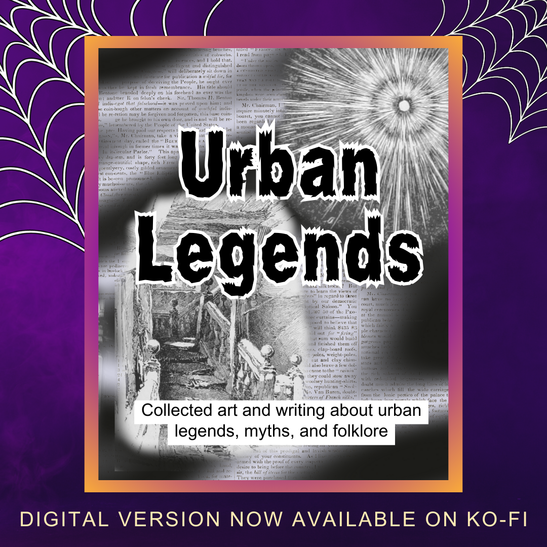
“Urban Legends” is a quarter-page zine that collects art and writing about urban legends, myths, and folklore. Eighteen people contributed stories, poetry, illustrations, and collages. Work was submitted from the U.S., Canada, Scotland, Belgium, and Germany
The finished zine is 36 pages (including covers); 4.25" wide x 5.5" high; printed in black & white; and bound with staples.
The cover is white cardstock. Interior pages are 24 lb white paper.
Yesterday I ran a zine-making station at a public library fundraiser. 🙂
The library had a Fall Fair with a bake sale, raffles, magic show, and games. Arts and crafts tables were inside the library. Here’s the zine-making station.
The library provided magazines, scrapbook paper, markers, glue sticks, scissors, and plain white paper. I brought copies of How to make a mini zine and What’s a zine?
This is the first time I’ve done a zine event with kids. Having collage materials definitely helps, so kids don’t have to write something on the spot.
Two girls spent about an hour and a half at the table, making two zines each, because they said they were having so much fun. 🥹
I think if I do more kid-focused zine events, I might make some kind of template that they can fill in. Having more of a guide might be a nice option besides having a blank piece of paper.
“What’s a zine?” is an 8-page mini zine that you can download and print on your own. It includes a brief introduction to zines: what zines are, some historical highlights, and common formats.
The zine is available on Ko-fi for free (or pay what you want).
The PDF is sized to print on one sheet of 8.5 x 11-inch paper (standard U.S. letter size).
This zine is licensed under Creative Commons (CC BY-NC-SA 4.0), which means you’re welcome to distribute and share copies for non-commercial use.
If you don’t know how to fold this kind of zine, search for “how to fold an 8-page zine” on YouTube to find tutorials.
“So You Met Your Past Self” includes tips for what to do when you meet a past version of yourself. This fictional zine is a handy guide for the time traveler in your life (even when that’s you).
I made the background for this zine by hand. I diluted blue fountain pen ink in water. Then I painted the ink on to watercolor paper.
After the paper dried, I drew an abstract design with a dark blue marker and white gel pen.
This kind of line drawing is a technique I learned from Katie Gebely.
First you draw dots on the page, at random. Then you connect the dots with straight lines. That’s what I did with the dark blue marker. Then I added shorter lines in white gel pen.
I wrote an essay for The Wrench Dispatch: The Movie Issue about visuals in Barbie and Pleasantville. The zine came out in January 2024 and collected essays about recent movies.
The essay is about 900 words, so I’m going old school and putting it under a Read More. So retro.
Five ways the Barbie movie uses visuals to share information about the world
The Barbie movie starts with a reference to the monolith in 2001: A Space Odyssey, and that’s how I knew that visuals would be important in this movie.
Barbie isn’t the first movie to share so much information about the world through visuals, but it’s the first one I’ve seen in a while to do it so well. Pleasantville (1998, directed by Gary Ross and starring Tobey Maguire and Reese Witherspoon) uses color and 1950s sitcom tropes to share information about the world.
Let’s take a look at how these movies use visuals.
1. Saturated colors are positive
In Barbie Land, colors are saturated and bright. The color palette leans heavily on pinks (so many shades of pink!). The sky is a perfect shade of blue, and the grass is a perfect shade of green. Nothing is out of place.
When Barbie and Ken go to the real world, colors are not as saturated. They feel more grounded. The outfits that Barbie and Ken wear while rollerblading have neon colors and busy patterns. They stick out immediately in the real world, even though the outfits would have been normal in Barbie Land.
In Pleasantville, David and Jennifer are transported to Pleastantville, a black and white 1950s-style sitcom. When everything is normal in Pleasantville, objects and people are in black and white. As Jennifer starts influencing the town, objects take on saturated colors, starting with a red rose. Characters appear in color after they express themselves or reach their potential.
Barbie uses colors to differentiate between Barbie Land (vibrant colors) and the real world (grounded colors). Pleastantville uses the transition from black and white to color to show changes in the sitcom world and characters.
2. No liquids in Barbie Land
There aren't any liquids in Barbie Land to fit the concept that there aren’t any liquids in Barbie playsets. Barbie takes a shower, but no water comes out of the shower head. She gets a carton of milk from the fridge, but the carton is empty. Barbie can walk across the pool because the surface is a sheet of blue plastic. And even the beach doesn’t have water, which is why Ken bounces off a rigid wave when he tries running into the ocean.
Pleasantville does have liquids. There's maple syrup at the breakfast table, and characters drink soda at the diner. But one thing Pleasantville is missing is toilets. In one scene, Jennifer goes into the bathroom at the diner and pushes a stall door open. It’s an empty space. This is a reference to TV standards in real life. In the 1950s and 1960s, American TV shows did not show toilets. It was considered bad taste.
3. Vehicles are props
Barbie knows how to drive but her car seems to go on its own. In one scene, she waves to other Barbies and even takes both hands off the wheel. The car continues on a perfect path on the road. Also, the car’s rear-view mirror is a sticker, playing into the idea that it’s there for show instead of function. The car is a toy and Barbie doesn’t actually need to look in the rear-view mirror while she drives.
In Pleasantville, the firefighters drive the firetruck, and they know how to use the ladders to rescue cats. But they don’t know what the hoses are for, since there weren’t fires in Pleasantville before. The firemen are surprised that the hoses work, because they never needed to use them before.
4. No one uses the stairs
All the dream houses in Barbie Land have stairs, but no one uses them. Barbies appear on one floor and then a different floor, much like how a child would move a doll from one floor to another in a dollhouse.
A similar thing happens in the sitcom world in Pleasantville. Scenes take place upstairs or downstairs, but we do not follow characters up or down the stairs. This adds to the construct of sets for TV sitcoms.
5. Physical appearance isn’t natural
Barbies in Barbie Land move in realistic ways, but details remind us that Barbies are dolls. When Barbie steps out of her slippers, her feet stay on tip-toes, as if she’s wearing heels. When Barbie walks, sometimes she poses her hands with straightened fingers (much like a Barbie doll's hands), instead of relaxed hands. There are moments when Barbie sits up or stands where her upper body moves as one, reflecting how Barbie dolls bend at the waist but otherwise have limited upper body movement.
After Barbie has thoughts about death, she loses some of her doll-like features. On the beach, she notices her feet are now flat. When she’s talking to Weird Barbie, Barbie notices she has cellulite on her thighs. These two examples show Barbie connecting with the real world.
In Pleasantville, there aren’t body changes, but there is a notable shift in how people look and carry themselves. Early in the movie, characters conform to each other. The women are in cardigans and poodle skirts with perfect makeup and hair. The men are all clean cut in tidy clothes. Everyone has good posture.
As the movie progresses and colors seep in, we see variations in their outfits and more relaxed body language.
Barbie and Pleasantville use visuals to tell the audience about the world. Both movies deliver visual information through colors, deviations from objects in the real world (liquids, vehicles, and staircases), and physical appearance. All these visual details enrich the characters and stories in Barbie and Pleasantville.
“How to make a mini zine” is an 8-page mini zine that you can download and print on your own. It includes a brief introduction to zines and instructions for how to fold an 8-page mini zine from a single sheet of paper.
The PDF is sized to print on one sheet of 8.5 x 11-inch paper (standard U.S. letter size). No access to a color printer? No problem — the zine looks great in black and white, too.
To fold the zine, you can follow the instructions directly on the PDF. Or if you prefer video instructions, search for “how to fold an 8-page zine” on YouTube.
This zine is licensed under Creative Commons (CC BY-NC-SA 4.0), which means you’re welcome to distribute and share copies for non-commercial use.
“The antidote to social media” is a mini zine that looks at how negative things are outweighing positives on social media. But social media platforms are still a good way to find people to connect with. The zine suggests ways to work around the negative aspects of social media.
“Children of Immigrants” is a half-page zine that collects art and writing about immigrant experiences. Thirteen people contributed stories, poetry, photography, illustrations, and collages.
The finished zine is 8.5" x 5.5", 28 pages (including covers), and printed in full color.
Everyone who contributed to the zine received a complimentary copy. The rest of the copies sold out, mostly at Lancaster Zine Fest. 😃 So, no more physical copies but you can download a digital version from Ko-fi for free or pay what you want.
Note: The digital version is a PDF meant to be read on a screen. The PDF is not formatted for printing and folding a paper copy.
“Shoveling sand” is a 20-page zine that collects my favorite writing advice from several writers. I grouped quotes by themes including “keep a notebook,” “don’t worry about being popular,” and “get the first draft down.”
This zine measures 5.25 inches high x 4 inches wide. The cover is printed in full color on white cardstock. The interior pages are printed in black and white on 24 lb. white paper. Designed and laid out in Canva.
“Cat’s Cradle” is a tiny story about mimicking someone. It’s not quite sci-fi, but it feels like it…maybe because it was inspired by a scene near the end of Annihilation. (I won’t spoil the movie and neither does the zine.)
Here’s the full text of the story:
It’s like playing cat’s cradle,
but we aren’t using string.
I do one thing.
She does something else that feels like…
an extension. A continuation.
And then we swap.
She does one thing—
says a phrase, draws some lines, moves her arm
just so.
I extend—
a line of poetry, a floral doodle, a yoga pose.
And then we swap.
The training protocol doesn’t specify how to teach.
Just that I’m supposed to.
Doctor Who celebrates its 60th anniversary next month. I collected some quotes from the Doctor in a zine…with random hipster photos. 🤭 Saturated colors, vintage objects, and a soft tone—this style of photo was all over the internet in the late 2000s and early 2010s.