I watched Elemental without knowing what to expect, because Disney’s marketing missed the mark (again). But I liked the movie overall. One of my favorite parts was seeing how each character used their element, like Ember inflating a hot air balloon.
I wanted to draw the scene with the hot air balloon floating over the city. I started with a pencil sketch. It’s rough. I wanted to figure out the foreground vs. the background and where the balloon was in the sky, in relation to the skyline.
Here’s a photo of when I was painting the larger areas. I simplified colors and composition (all those buildings!) because it’s so much detail.
Here’s an illustration of Bruce Wayne’s mansion (Wayne Manor). I really like how the blue highlights contrast against the black on the building and the trees.
Here’s an illustration inspired by a scene in Back to the Future: Marty walking into Hill Valley.
I made this as part of a course on illustrating with Posca pens. The assignment was to use two shades of the same color as the main colors in the piece. Since a lot of this image is grassy fields, I chose two shades of green. I kept Marty’s outfit realistic (orange vest and blue jeans) to signify that he’s out of place…or, more accurately, out of time.
Here are some thumbnail sketches I did prior to painting the scene. I wanted to test out colors–what looked good for the grass and Marty’s outfit.
And here’s the simple pencil sketch I started with.
I had a couple Posca pens for a few years, but I hadn’t done much with them. I saw this course and thought it would be a great way to practice with Posca pens.
The course covers how to create a pencil sketch to get the composition down. Then it explores various color schemes to determine how to color the illustration. I especially like the challenge of limiting the number of colors used.
I like the process I learned in this course. It takes me several hours to finish an illustration, but I really enjoy the time I’m spending learning and practicing. I’ll share my illustrations here as I finish them.
The course encourages choosing a theme that will motivate you to keep working on sketches. I chose places in movies, TV shows, and books. First up is The Candy Bar from Jimmy Neutron.
Here’s the pencil sketch:
I chose to go with realistic colors, so I used Posca pen colors that are close to what this location looks like in the show.
Here’s a progress photo, with the larger areas of color done:
And here’s the finished illustration:
I really enjoyed making this as my first attempt at a Posca pen illustration!
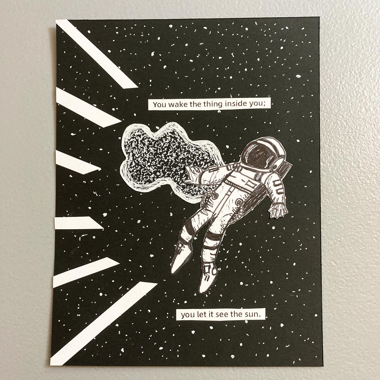
I contributed a page to the Pocket Thoughts Annual #3, a collaborative zine that features 25+ zinesters from around the world. Each contributor was welcome to do whatever they wanted with their page. I made this astronaut illustration:
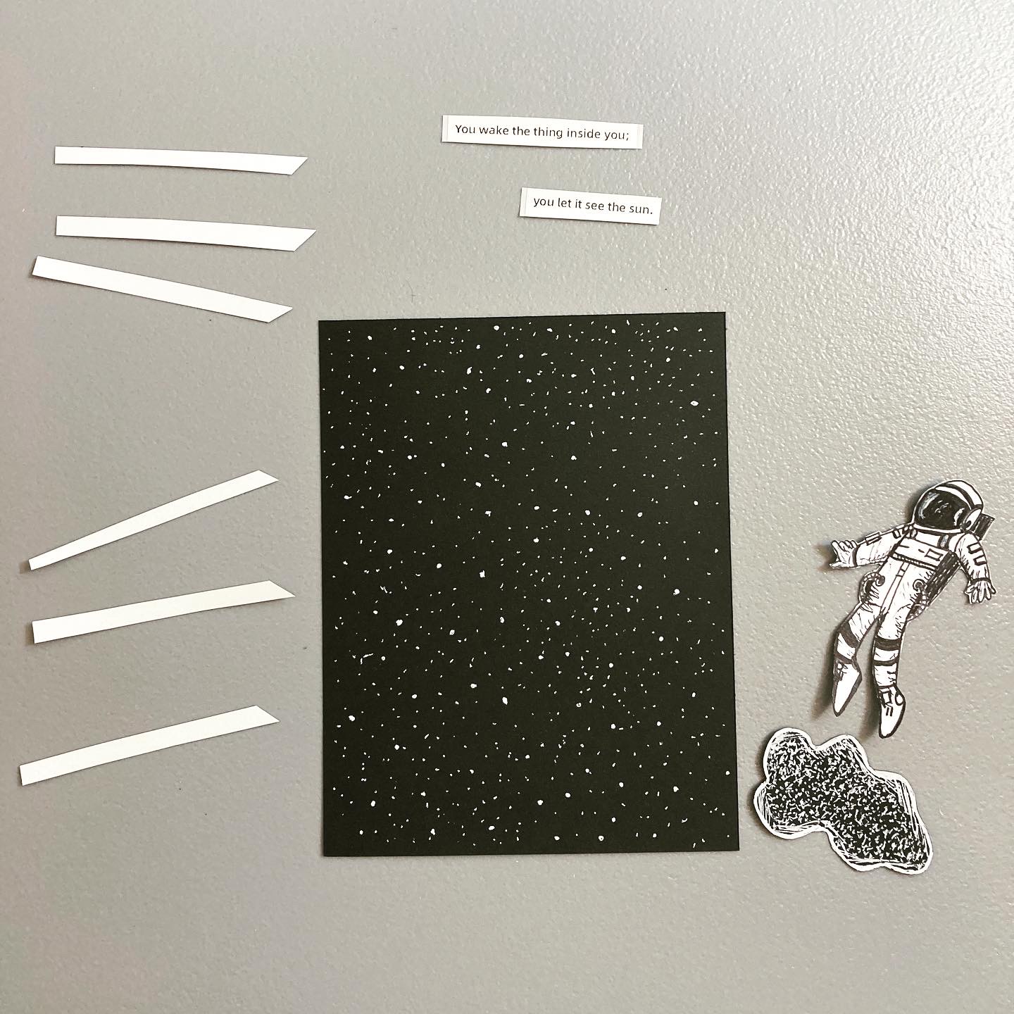
I wanted to go for a collage look, but still where I made each part of it. This is what the elements looked like, before I put the page together:
I started with black cardstock and a white gel pen for the stars in the background. If you've seen my space-themed illustrations, you know I love drawing stars on black paper. 🙂
I drew the astronaut on white cardstock and the…cloud thing on black cardstock with a black fineliner and white gel pen. Then I cut those out.
The white strips on the left of the page are pieces of white cardstock.
I printed the text using my Phomemo printer. It's so handy for little things like this!
And then I glued everything into place. To send it in for the zine, I scanned it, so I could send a jpg.
Making this page took a while since I created each element separately, but I'm really happy with how it came out.